

Your cart is empty.
Keep shoppingGet started Creating Websites Everything you need provided
31,969 students
Get started Creating Websites Everything you need provided
Everything you need to know on how to create your own websites even sell them for extra income. Online income made easy
Created byLaurence Svekis
Last updated 11/2024
English
English [Auto],
What you'll learn
- Create websites
- know where to sell services
- understand how to sell website to clients
- update web content
- HTML and CSS
- How everything fits together online
- how web designers make money
Explore related topics
Coding Exercises
This course includes our updated coding exercises so you can practice your skills as you learn.
See a demo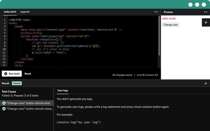
Course content
4 sections • 45 lectures • 2h 42m total length
Requirements
- Basics of websites
- we provide all the resources needed
- desire to learn web development
Description
Create Websites become a Web designer Complete course start to finish.
Step by Step learning how to build a website from scratch! We provide links to all the best resources and everything you need to build websites.
- Make money online creating websites
- start your own business
- save money create your own websites
This course is designed to help you learn to make websites, we start with the basics and concepts that you need to know to launch your own web business or create your own websites.
We demonstrate how to use HTML and CSS together to bring your web code to life. Use HTML and CSS to create web templates that can be sold to make extra income.
Everything you need to learn about creating websites is provided within this course.
- no wasted time watching someone type
- quick lessons get right to the point
- fully covered topics with real world examples
- source files downloadable to work along
- challenges and lessons
- 30 day money back guarantee
- new course material added regularly
- trusted name in education since 2002
- full HD easy to read source coding
- quick response support to students
- regular discussions
We show you how to start with nothing and begin to create websites. Picking your web editor and HTML5 boiler plates. Best web design tools and resources. How to answer client questions and what you should ask clients before beginning. How to set the groundwork to begin the web design process. Picking a domain and hosting. SEO best practices and google webmaster guidelines. How to design with mobile in mind. Full web design process including wire frames and navigation planning.
We walk you through HTML and CSS and how to code. Lots of examples and practice exercises.
Who this course is for:
- web designers
- anyone who wants to earn extra income thru web design
- anyone who wants to create their own websites
- web content producers
- web managers