
Dein Einkaufswagen ist leer.
Weiter einkaufenComplete Full Stack Web Development Bootcamp - AI Integrated
3.751 Teilnehmer:innen
Complete Full Stack Web Development Bootcamp - AI Integrated
Complete Web Development in One Course with Modern Stack - JavaScript, Node.js, React, MongoDB, Linux and lots more!
Erstellt vonManik (Cloudaffle)
Zuletzt aktualisiert 1/2025
Englisch
Englisch [Automatisch],Französisch [Automatisch],
Das wirst du lernen
- Learn To Build Complete Web Applications By Working On The Full Stack.
- Understand How the Internet Works and How You Can Build Any Kind Of Website.
- Become Job Ready, Take Up A Freelancing Project or Build Your Dream Startup After Completing The Course.
- Learn Complete Front-end Programming With HTML, CSS, JavaScript, React Tailwindcss and Much More.
- Learn Complete Back-end Programming With Node.js, Express, MongoDB, Mongoose and Much More.
- Learn How You Can Deploy Your Applications By Building Your Own Severs on AWS.
- Learn By Building Projects, We Build 4 Large Projects Together.
- Practice Whatever You Have Learned By Working on 75 Coding Exercises.
Zugehörige Themengebiete entdecken
Programmierübungen
Dieser Kurs enthält unsere neuen Programmierübungen, damit du deine frisch erworbenen Skills direkt praktisch anwenden kannst.
Demo ansehen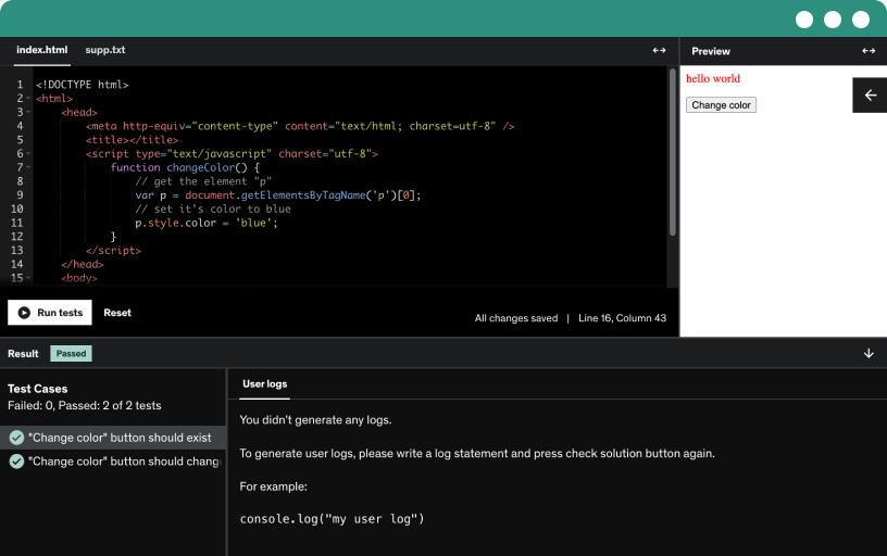
Kursinhalt
47 Abschnitte • 495 Lektionen • 62 Std. 37 Min. Gesamtdauer
Anforderungen
- You Do Not Need Any Programming Experience
- Just Need a Computer With Access To The Internet
- I Will Provide You With Full Guidance On How To Setup Your Development Environment
- Passion To Learn
Beschreibung
Dive into our Complete Web Development Bootcamp: a modern, in-depth course integrating AI tools to teach you cutting-edge development techniques for a comprehensive learning experience. Even if you are an absolute beginner you can learn complete web development in this course.
Some Of The Important Topics Covered (Not A Complete List):
Computing Basics
HTML
CSS
JavasScript
Git
Github
Node.js
React
Linux CLI
Express
MongoDB
Shandcn/ui
Mongoose
JWT Tokens
Virtual Servers With Nginx
And Lots More ...
Comprehensive Learning: From Basics to Practical Application
This course is crafted from the ground up to offer a coherent, well-articulated learning experience. It covers everything from underlying technologies to practical application, ensuring that even those new to programming can confidently progress while also catering to more experienced developers looking to solidify their skills.
Hands-On Coding: Exercises and Projects Tailored for Every Skill Level
Throughout this course, you'll engage in numerous coding exercises and build complete projects, enhancing your understanding and ability to apply what you've learned in real-world scenarios. Whether you're starting with no knowledge of programming, looking to round out your front-end skills with back-end knowledge, or aiming to transition from back-end to full-stack development, this bootcamp is tailored to your needs.
Unlocking Career Paths in Technology
Explore how this comprehensive web development course can pave the way for diverse career opportunities in technology.
Job Readiness: Gain the practical skills needed to secure a position in the tech industry.
Freelancing: Build a robust portfolio to attract and manage freelance projects.
Entrepreneurship: Acquire the knowledge to start and grow your own tech startup.
Who Am I?
I'm Manik, your instructor with over 15 years of programming experience and a dedication to teaching on Udemy for the past two years. My approach breaks down complex concepts into digestible, easy-to-understand segments, focusing on detailed and in-depth discussion in each lecture.
Embracing AI in Web Development (Spoiler: This is NOT an AI Course but teaches you how to embrace it and use it as a tool)
Additionally, this course uniquely integrates Artificial Intelligence (AI) into the curriculum, teaching you how to use AI as a tool in development. While AI is just a small component of the course, it's pivotal, equipping you with forward-looking skills that align with current industry trends.
Topics That You Will Learn In This Course (Not an Extensive List)
Basics Of Computing: Learn the fundamental concepts of computing, including how computers work and basic programming principles.
HTML Basics: Master the basics of HTML, the backbone of the web. Create structured documents by understanding tags, elements, and attributes.
HTML Structure: Dive deeper into HTML to structure complex web pages. Learn about semantic HTML and best practices for a clean, organized web layout.
Git and GitHub: Master version control with Git, and use GitHub to collaborate on projects. Learn to commit, push, and merge with confidence.
CSS Basics: Understand the foundations of CSS to style web pages. Learn about selectors, properties, and setting up stylesheets for a professional look.
CSS Selectors: Gain detailed knowledge of CSS selectors to efficiently target and style specific elements within your HTML documents.
Styling Elements Using CSS: Enhance your web pages by learning to style elements using CSS. Discover techniques for colors, fonts, and layout designs.
The Box Model: Understand the CSS Box Model, the key concept behind layout on the Web. Learn how padding, border, and margins affect your designs.
Inheritance and The Cascade: Explore how CSS rules cascade and are inherited in web documents, and learn to use this behavior to write effective CSS.
Responsive Web Design And Flexbox: Master responsive design techniques with CSS Flexbox to ensure your websites look great on all devices.
Layout Project: Apply your skills in a practical layout project, designing a complete web page from scratch using HTML and CSS techniques.
Forms: HTML and CSS: Learn to create interactive forms for user input, focusing on form structure, validation, and styling with HTML and CSS.
Tables: HTML and CSS: Master the creation and styling of HTML tables to display data clearly and effectively, with advanced CSS styling options.
Getting Started With JavaScript: Dive into JavaScript basics, learning how to add interactive and dynamic elements to your web pages.
Objects and Arrays: Understand JavaScript objects and arrays to manage data efficiently and perform complex data operations.
Control Flow: Conditionals and Loops in JavaScript: Learn to control the flow of your JavaScript code using conditionals and loops for effective decision-making and repetition.
Functions and Methods: Deepen your JavaScript knowledge by mastering functions and methods for reusable code and modular programming.
JavaScript Advanced Techniques: Explore advanced JavaScript techniques, including closures, async/await, and advanced data manipulation for sophisticated web applications.
Working With The Document Object Model (DOM): Learn to manipulate and interact with webpage content dynamically using the DOM API.
DOM Traversal: Master navigating through the DOM tree, accessing and manipulating elements effectively.
DOM Events: Understand how to handle events in JavaScript to create interactive user experiences.
Browser Object Model (BOM): Explore the BOM to interact with the browser, managing windows, location, and more.
JavaScript Calculator Project: Build a fully functional calculator to apply your JavaScript skills in a practical project.
JavaScript Modules: Learn to organize and maintain your JavaScript code efficiently using modules for better scalability and manageability.
The Linux Command Line: Gain proficiency in using the Linux command line for powerful scripting and system management.
Async JavaScript: Master asynchronous programming concepts in JavaScript using callbacks, promises, and async/await.
Introduction To Node.js: Dive into Node.js for server-side programming, understanding its asynchronous, event-driven architecture.
Getting Started With Express: Learn to build web applications with Express, a fast, unopinionated framework for Node.js.
Express Middleware: Understand middleware functions in Express to handle requests, modify request and response objects, and end response cycles.
The Controller: Learn about the controller part of MVC architecture in web apps, focusing on routing and logic implementation.
Getting Started With MongoDB: Get introduced to MongoDB, a NoSQL database, and learn how to integrate it with your applications.
Schema, Model and Mongoose: Explore how to define schemas, create models, and use Mongoose for MongoDB data modeling and validation.
Validation and Error Handling: Learn how to validate user input and manage errors effectively in your applications to ensure robustness.
Node Environment and Configuration: Understand how to configure the Node.js environment and manage settings using environment variables for scalable apps.
Pagination and Filtering: Master techniques to paginate and filter data in your applications, improving performance and user experience.
User Authentication And Relationships: Dive into implementing user authentication and managing relationships between users and data in your applications.
Documenting API: Learn the best practices for documenting your APIs to ensure they are understandable and usable by other developers.
Introduction To React: Get started with React, a popular JavaScript library for building dynamic and efficient user interfaces.
React Basics: Understand the fundamental concepts of React including JSX, components, and state management.
Tailwind CSS: Learn how to style your applications efficiently using Tailwind CSS, a utility-first CSS framework for rapid UI development.
React Router: Master navigating and routing in your React applications, creating seamless single-page applications with dynamic routing.
Layout and shadcn/ui: Explore advanced UI layout and shadow techniques to design compelling, visually appealing user interfaces.
Validation + ZOD + React Hook Form: Learn to implement robust form validation using Zod for schema definition and React Hook Form for efficient, scalable forms.
Client Server Synchronization: Understand the principles of synchronizing data between client and server, ensuring consistency and reliability in your applications.
Context API and Global State: Master using React's Context API to manage and share global state across components, simplifying state management.
Deploying Application: Gain the skills to deploy your applications effectively, covering deployment strategies, servers, and continuous deployment workflows.
Embark on your journey to becoming industry-ready with this all-encompassing bootcamp, where you'll not only learn to develop across the full stack but also discover how to leverage AI effectively in your projects. Whether you aim to secure a job, take on freelance projects, or launch an application for your startup, this course prepares you for success.
Für wen eignet sich dieser Kurs:
- Anyone Who Wants To Learn Complete Web Development.
- Front-end Programmers Who Want To Become a Full Stack Engineer.
- Back-end Programmers Who Want To Become a Full Stack Engineer.
- Also Suitable For Absolute Beginners With No Prior Programming Experience.