
Your cart is empty.
Keep shoppingWeb Development HTML CSS & JS a Beginner to Advance guide
3,813 students
Web Development HTML CSS & JS a Beginner to Advance guide
HTML5 CSS3 SASS and JavaScript Modern Responsive websites using CSS Flexbox & CSS Grid, Manipulate the DOM & send JSON
Created byNorbert B. Menyhart
Last updated 3/2024
English
What you'll learn
- HTML5 Boilerplate, Semantic Layout and essential Tags
- CSS Fundamentals including FlexBox and CSS Grid
- CSS3 Variables, Transitions, Dropdowns, Overlays & More
- JavaScript
- Create static HTML and CSS Landing pages
- SASS with advance CSS technology
- Flexbox & CSS Grid Projects
- Web Development
- Front End Web Development
- Create a beautiful, responsive landing page for a startup
- Use common JS data structures like Arrays and Objects
- Manipulate the DOM with vanilla JS
- Write Javascript functions, and understand scope and higher order functions
- Create static HTML and CSS portfolio sites and landing pages
- Learn to organize your code and become a professional web developer
- Learn HTML essentials
- Learn CSS essentials
- Learn JS essentials
Explore related topics
Coding Exercises
This course includes our updated coding exercises so you can practice your skills as you learn.
See a demo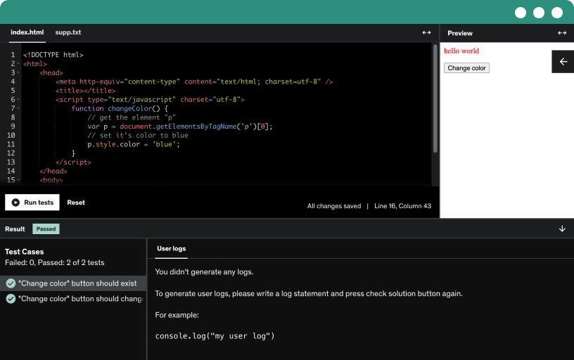
Course content
20 sections • 149 lectures • 26h 34m total length
Requirements
- Basic PC/Mac Knowledge
- Beginner Curiosity
Description
This is a beginner friendly course. This course will tech you the Foundations of Web Development. This a more practical orientate Course. Aldo we will start up slow with some basic definitions, the main focus here is to have as much as possible hands on experience. Learning by doing is the key word. That means Examples, Assignments and Exercises!
At this point I would like to invite you to join me on this journey and enrich yourself with the foundations of web development. In this Course You will learn Modern HTML 5, CSS 3, and JavaScript, and through applying them you will be able to building from Easy to progressively more complex responsive Responsive Web Pages.
Throughout the course we cover tons of tools and technologies including:
HTML5
CSS3
CSS FelxBox
CSS Grid Layout
Projects
SASS
JavaScript
DOM Manipulation
JSON
Projects , Projects and more Projects :)
Two Important Notes about this Course:
1. This is a hands-on Learning by doing Course. This means that we are going to start up Slowly with basic definitions in HTML and CSS and then we will combine them together by building the structure and applying design to our sites. After that we will apply JS in order to make the Site do Thinks.
2. Is that I will be constantly Updating the Content with New Documentation, Examples and Exercises in order to bring you as much value as possible. So you can always lean beck on this Course if you want to refresh your memory about something.
Bonus!
3. The most important thing the you need to know in life is where to find the information you need!
Who this course is for:
- Beginner Web Developers
- Beginner Web Designers
- Beginner HTML
- Beginner CSS
- Beginner SASS / SCSS
- Beginner JavaScript