Your cart is empty.
Keep shopping

Teach on Udemy
Turn what you know into an opportunity and reach millions around the world.
Learn MoreHow to create Websites Build 10 Websites From Scratch
Rating: 4.2 out of 54.2(460 ratings)
11,782 students
How to create Websites Build 10 Websites From Scratch
Build 10+ complete websites from scratch, supercharge your portfolio learn how to create websites HTML CSS JavaScript
Created byLaurence Svekis
Last updated 11/2024
English
English [Auto],
What you'll learn
- create several different types of websites
- understand what HTML CSS and JavaScript can do
- Be able to make webpages dynamic
- Create modern websites from scratch
- make interactive web content
- design and develop a website
Explore related topics
Coding Exercises
This course includes our updated coding exercises so you can practice your skills as you learn.
See a demo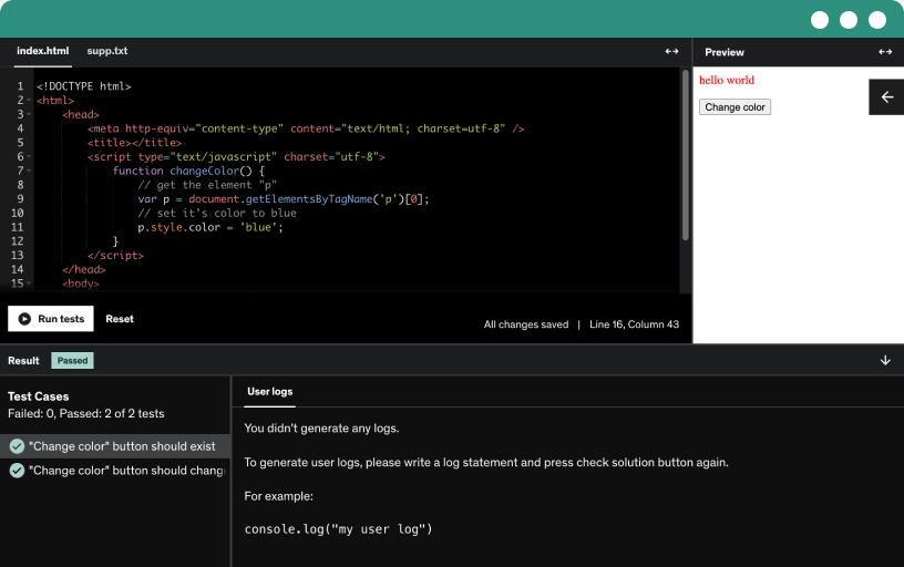
Course content
21 sections • 436 lectures • 34h 1m total length
- Introduction to Course7:31
Learn to build 10 complete websites from scratch by mastering HTML, CSS, JavaScript, and jQuery, using real-world projects and Bootstrap to create a strong front-end portfolio.
- How to use this course7:49
Construct foundational web pages by mastering HTML, CSS, and JavaScript basics, then build 10 fully responsive, multi-style websites from scratch using jQuery, AJAX, and Bootstrap.
- Course resources6:20
Explore using Brackets with live preview, Chrome dev tools for inspection, and a Zap local server to run localhost for web projects, including device emulation for responsive design.
- Course Resources Online7:26
Plan and wireframe your website using browser tools, employing placeholder content and a wireframe view of a web page. Leverage Bootstrap, Font Awesome, Google Fonts, and CodePen for rapid prototyping.
- Getting a website2:52
Learn how to get a website online by choosing and registering a domain name, selecting hosting, and uploading your files to your server so visitors reach your pages.
- what is HTML CSS and JavaScript5:59
Explore how HTML provides page structure with head and body, how CSS styles and responsive design shape a site, and how JavaScript adds dynamic interactions via the DOM.
- Resource List0:12
- Introduction to learning HTML2:21
Explore the basics of HTML, including images, hyperlinks, headings, paragraphs, lists, and semantic tags like header and section, plus forms and how to structure a web page using an editor.
- Basics of HTML7:03
Explore HTML basics by building the page structure with opening and closing tags, head and body sections, and paragraph elements, while understanding how browsers render and style HTML templates.
- How to create a basic HTML template11:38
Develop a basic html template by structuring with doctype, html, head and body, and using meta tags, charset, viewport, title, and lowercase tags for browser rendering and search engine optimization.
- Basic HTML template source code0:09
- Headings Paragraphs and Line Breaks Content Structuring7:32
Explore how to structure web content using headings, paragraphs, and line breaks with HTML, focusing on H1–H6 usage, proper paragraph nesting, and clear content organization.
- Adding images into HTML5:10
Learn to insert images with the img tag, set src, and use placeholder images like Lorem Pixel, with width, height, and responsive sizing.
- Ordered Lists Unordered Lists3:51
Learn to create ordered and unordered lists, improve accessibility for screen readers, and customize list markers with letters or roman numerals, including navigation menus and basic CSS styling.
- Hyperlinks Relative paths vs Absolute Paths8:07
Learn how hyperlinks power web navigation with anchor text and href, including internal anchors, relative vs absolute paths, and opening external links in new tabs.
- Divs and Spans Tel and Mailto9:00
Describes using divs and spans to structure content, create anchors, and link to mailto and tel actions. Shows building a one-page site with navigable sections and easily accessible contact information.
- HTML5 Semantic Elements5:14
Explore how semantic elements such as header, nav, section, article, and footer replace divs to create meaningful, accessible web structures, and learn to use wrappers for layout and top-down organization.
- Transfer build content to editor2:32
Transfer build content to editor demonstrates importing code from CodePen into a web page, linking HTML, CSS, and JavaScript files, and adding libraries such as Bootstrap, Foundation, and Animate.css.
- Basic HTML page structure sample1:18
- Create a basic HTML template
- HTML Quiz
- How to create HTML forms8:24
Learn to build HTML forms from scratch using form, input, label, and button elements; configure GET and POST methods, placeholders, IDs, and action to send user data to a server.
- HTML5 Input types13:02
Explore HTML5 input types for forms, including email, radio buttons, checkboxes, color, date, datetime, month, week, time, number, and url, with practical code pen demonstrations.
- Additional Form Elements4:55
Learn to implement select dropdowns and text areas in forms, assign names and values, set defaults, and apply attributes like required, disabled, rows and columns to enhance web forms.
- Form Resources3:05
- HTML conclusion5:01
Explore core HTML elements and inline text semantics, structure content with semantic tags, and practice embedding media, canvas drawings, tables, and forms for web pages.
- Introduction to CSS2:33
Explore cssa basics, apply it to your html, and transform a site with colors, fonts, backgrounds, and responsive design using media queries.
- CSS selecting elements from HTML8:47
Learn how to style websites with CSS using inline, on-page, and external stylesheets. Understand selectors by tag, ID, and class, and how to nest and isolate elements for precise styling.
- Working with CSS colors5:25
Learn to target elements with CSS using classes, IDs, or tags and apply background and text colors to headers and paragraphs, including hex, rgb, and rgba colors with alpha transparency.
- CSS Background options7:06
Explore CSS background options by applying a background image to the body, adjusting color, position, repeat, size, and attachment, and using shorthand to simplify declarations.
- Adding Fonts3:02
Apply font choices across your site using Google Fonts, import or link methods, set font-family on the body, and customize link styles for a modern look.
- Pseudo classes and design patterns4:47
Learn to style hyperlinks with CSS by removing underlines, customizing color, and using pseudo-classes for hover effects, guided by common design patterns from Yahoo patterns for clear user interaction.
- Using the Float property5:55
Learn to use the float property to align images and create a two-column layout with a main content area and a sidebar, including clear and flow management.
- Box Model Margins9:38
Explore the CSS box model by adjusting margins and padding, centering a wrapper with auto margins, applying max width, and using shorthand margin syntax to control layout.
- Box Model Padding shorthand4:20
Apply the CSS box model using the padding shorthand to control inside spacing, borders, and content, and adjust margins to center wrappers and create space for sidebars and main content.
- CSS to create a navbar9:03
Learn to tailor font sizes with em units and build a horizontal navigation bar by styling an unordered list, removing bullets, float items, and applying hover effects.
- Display properties CSS3:14
Explore CSS display properties, including block, inline, and inline-block, and learn how display none and visibility hidden affect layout, positioning, and space, with examples from navigation bars.
- CSS overflow handling2:39
Master CSS overflow handling by learning how to control content visibility with overflow, hidden, scroll, and auto, and how to use overflow-x and overflow-y for horizontal or vertical scrolling.
- CSS positioning elements3:40
Explore CSS positioning with absolute, fixed, relative, sticky, and static to place elements; absolute floats over content, fixed stays in view, and relative and static affect flow.
- CSS tweaks and updates8:25
Clear floats to keep navigation aligned. Enhance the page with borders, border-radius, padding, centered text, and explore pseudo elements and pseudo classes like first child and first letter.
- Media Queries making your website Responsive11:05
Learn to make a website responsive using media queries, set breakpoints, and implement mobile-first design with max and min widths, managing sidebars, navigation, and content spacing across devices.
- HTML CSS summary2:57
Apply CSS properties to HTML to design a website, plan the structure for flexible styling, and experiment with different layouts using an editor, CodePen, and Chrome DevTools.
- Source Code HTML and CSS2:40
- CSS Conclusion2:09
Explore CSS fundamentals by working with the course's source code, copying and pasting into CodePen or your editor, and using live preview to see your own styled pages.
- Introduction to JavaScript Overview2:11
Explore how JavaScript adds programming logic to web pages, using variables, arrays, objects, loops, functions, conditionals, and events to enable user interactions and responsive updates.
- What is JavaScript2:22
Learn how to add javascript to web pages, create interactive elements with the DOM, and implement dynamic effects using HTML, CSS, and tools like CodePen and Brackets editor.
- How to add JavaScript in web pages5:17
Learn how to add JavaScript to web pages by creating .js files, using script tags, and linking external scripts to render in the browser, enabling reusable and easily updated code.
- Basics of JavaScript Dev Tools How to Comment and more10:55
Place JavaScript in HTML at top or bottom, understand the document object model, and use comments, semicolons, and whitespace to write readable code while debugging with dev tools console.
- Introduction to Variables within JavaScript11:05
Discover how to declare and use variables in JavaScript, including numbers, strings, and booleans, and interact with prompts, alerts, and the browser console via the window and the document objects.
- Understanding Variables10:50
Learn how to name variables with camel case, avoiding spaces and starting names with letters, dollar signs, or underscores. Explore operators, declarations, and how strings interact with numbers in JavaScript.
- Variables Source Code0:10
- Arrays and Objects8:03
Explore arrays and objects in JavaScript, learn indexing from zero, access values with brackets or dot notation, and handle dynamic values for looping.
- Working with Arrays and Objects9:25
Learn to work with arrays and objects in JavaScript, update and output values, access data, and push new items, while noting rendering order and array length.
- Using and updating array values10:53
Learn how to create and manipulate arrays in JavaScript, including push, pop, shift, splice, slice, sort, and reverse, to add, update, remove, and reorder items.
- Array and Object Source Code0:08
- Introduction to Functions7:59
Explore how functions in JavaScript execute a block of code, accept arguments, and return values, and compare global and local scope in various call patterns.
- Local Global Variables in functions3:36
Explore variable scope in JavaScript, distinguishing global and local scope within functions, and learn how returns and external values interact with local variables.
- Source code Functions0:06
- Ternary Comparison9:03
Learn how JavaScript operators work, including increment and decrement, assignment versus comparison, equality checks (== vs ===) and types, and the ternary operator and logical operators that drive conditional statements.
- Conditional Statements5:54
Master conditional statements to execute code based on conditions, using if, else, and else if. Explore switches for value-based decisions and understand true/false outcomes.
- Switch Statements4:55
Master using switch statements in JavaScript to evaluate an expression, select the matching case, apply breaks, and handle numeric and string values with a default option.
- Source Code Statements conditions0:19
- Introduction to looping4:59
Explore JavaScript loops, including while, do-while, and for loops, and how conditions, increments, and console.log control when a block runs and breaks.
- JavaScript For Loops6:43
Master JavaScript for loops to iterate arrays and objects, output values with console log, access array length, and retrieve object properties by key or index.
- Source Code Loops0:10
- Introduction to the Document Object Model6:13
Learn how the document object model enables dynamic interaction by accessing and manipulating HTML elements with JavaScript and event listeners.
- Accessing Page Elements from JavaSCript4:29
Learn to select and update page content with JavaScript by using the document object model, targeting elements by id or class, and manipulating innerHTML and innerText.
- Selecting Elements via JavaScript8:44
Learn to select elements with JavaScript using id, name, tag name, and class name, then loop through list items or use query selector to update page content via the DOM.
- Source Code Selecting0:06
- Updating CSS with JavaScript7:27
Learn to update CSS with JavaScript by selecting the footer element with querySelector or getElementById and changing its style properties, such as background color, color, and margins.
- Source Code CSS0:02
- JavaScript Events5:06
Learn to listen for click events with JavaScript event listeners, update styling and colors (including red and blue), and log interactions to the console. Explore keeping listeners separated in JavaScript.
- Event Listeners selecting elements9:34
Learn to move inline event listeners into JavaScript, select list items with querySelector or getElementsByTagName, loop through items, and attach dynamic click events.
- Source Code Listeners0:28
- addEventListener More events trigger options7:00
Use addEventListener to attach and remove listeners, beyond on click, and loop through items to create dynamic interactive UI with mouseover and the event object.
- Source Code addEventListener0:27
- What can you do with JavaScript3:57
Explore how JavaScript powers dynamic, interactive web pages by manipulating the DOM, handling events with listeners, and combining HTML, CSS, and logic to create polished applications.
- JavaScript Overview Conclusion2:42
Apply your JavaScript knowledge by copying code into an editor or CodePen, then run it in the console or browser. Explore output methods like document.write while interacting with HTML.
- Introduction to using jQuery2:21
Explore how jQuery speeds up writing JavaScript, enables event listeners, animations, and ajax data retrieval to create interactive web pages; review library loading and sample source code.
- What is jQuery and why do we use it5:12
Explore how jQuery, a lightweight free JavaScript library, simplifies DOM interactions, small in size and loads quickly, animations, events, and AJAX, with CSS-like selectors and easy CDN integration.
- Getting Started with jQuery6:17
Learn to add jQuery to a web project, use the $ factory and CSS-style selectors, and rely on document ready to update a div with hello world.
- jQuery Selectors6:08
Explore how to use jQuery selectors to access and manipulate HTML elements, update text, HTML, and input values, and select by id, class, and tag.
- Each value from mulitple selector elements4:06
Learn to select multiple elements with tags and classes, loop through them using the each method, and update or log values for list items with jQuery selectors.
- Updating elements via jQuery7:11
Update list items with jQuery by looping through elements and using prepend, before, after, append, empty, and remove to manipulate content. Learn the difference between empty and remove for pages.
- Source Code Selectors HTML0:12
- CSS selectors and jQuery selectors2:15
Explore CSS selectors and jQuery selectors to target specific elements, such as the first child, and apply styles like an aqua background, with syntax parallels between CSS and jQuery.
- Introduction to event binding2:33
Learn to bind events by attaching click listeners to list items without looping, prevent default on hyperlinks, and explore mouse, keyboard, form, and window events using a query-based approach.
- Event Listeners jQuery Mouse Events6:39
Binds event listeners to list items with jQuery, enabling click and hover interactions that update the first name input with the clicked item's value, using on to attach multiple handlers.
- Event source code0:03
- Keyboard event triggers6:08
Attach a keyboard event listener for keydown on the first name input to log key, value, and event type, and explore focus and change events to enhance form interactions.
- Source Code keyboard events0:04
- Resize and Scroll event listeners on window object7:06
Learn how to attach resize and scroll event listeners to the window object, track window width and scroll position, and display live updates.
- Source Code Windows Object2:40
- Finding input values from form jQuery6:23
Learn to traverse the DOM with jQuery, moving through parents, children, and siblings, and to gather form inputs with find. Implement prevent default and loop through fields to capture values.
- jQuery Traversing elements7:34
Learn to traverse the DOM with jQuery, exploring parent and sibling relationships, accessing children, and updating styles such as background color while inspecting elements in the console.
- Select elements from HTML content5:21
Learn to traverse the document object model and select elements with query selectors, target siblings by id or class, and apply styling such as background color using css and jQuery.
- Source Code Selection0:03
- jQuery working with CSS7:29
Update css with jquery by selecting elements, applying properties, and toggling classes through click and hover interactions to style content and create simple effects.
- Source Code CSS0:02
- Hide and Show page sections9:10
Explore how to hide and show web page sections using jQuery, with fade, slide, and animate effects; learn event handling, traversing the DOM, and toggling display to build dynamic menus.
- jQuery effects Fading4:03
Learn to use jQuery fading effects to reveal or hide page sections, control fade speeds, run callbacks on completion, and toggle classes to change backgrounds for interactive content.
- jQuery Effects Source Code0:02
- JQuery Sliding Effects4:33
learn to implement jquery sliding effects to reveal and hide page sections using slide down and toggle, starting with display none and targeting wrapper elements.
- jQuery Animate10:35
Learn to animate page sections with jQuery animate, scrolling the body to section tops using offset and index, and build a responsive, fixed navigation bar.
- Source Code2:56
- jQuery AJAX made easy JSON and more5:32
Master how jQuery simplifies asynchronous ajax requests to load content into HTML without page reloads. Explore get, post, load, and ajax methods and the role of JSON data.
- Loading data into HTML via jQuery6:44
Load json data into a web page using ajax with jquery, via a button click, display results in an output area, with a callback updating the UI and codepen examples.
- jQuery AJAX get getJSON9:21
Explore jQuery ajax get and getJSON to fetch server data from a php file and display JSON fields like first name on the page.
- AJAX with jQuery9:51
Learn to use Ajax with jQuery to send data via get and post, handle callbacks, and customize requests with Ajax options for sending payloads and handling success or error.
- Source Code0:11
- jQuery conclusion2:16
Explore how jQuery lets you write less code and do more with Ajax and event triggers. Practice using CodePen, review the source code, and visit jquery.com to stay updated.
- Resources jQuery0:01
- using map and each within jQuery7:10
Explore how to manipulate arrays in jQuery by using each to loop values and map to create new arrays, then output results to HTML.
- Source Code map and each0:07
- Introduction to using Bootstrap2:29
Set up your development environment with brackets and your browser, explore the Bootstrap beta version, and prepare to create web pages using Bootstrap in this course.
- Get Bootstrap Setup Template7:56
Learn to bring Bootstrap into web projects via CDN links, with CSS and JS files, and include jQuery and Popper.js, then set up a starter template and ensure file order.
- Basic Bootstrap Template0:10
- Bootstrap Layout Containers4:56
Explore bootstrap layout containers by building two divs, one with container and one with container-fluid, and using color utilities to visualize responsive grid behavior across breakpoints.
- Source Code Containers0:12
- Introduction to the Grid11:57
Build a responsive Bootstrap grid using container, row, and column classes in a 12-column system. Explore breakpoints, fluid containers, and color utilities to create flexible, multi-column layouts.
- Source Code0:24
- Do more with the Grid11:25
Master bootstrap grid concepts with a 12-column layout, adjusting column widths, gutters, and order, and centering content with auto margins. Explore nested grids and breakpoints for responsive, centered layouts.
- Grid Source0:19
- Jumbotron Bootstrap 42:48
Explore Bootstrap's jumbotron and jumbotron fluid to highlight content with margins, padding, and rounded corners, compare their layout differences, and use related utilities.
- Source Jumbotron0:04
- Margins and Padding Bootstrap2:30
Learn how to use Bootstrap 4 spacing utilities to control margins and padding, including margin left and padding classes with breakpoint options, and practice applying them to page layouts.
- Resources Margins and Padding Bootstrap0:48
- Bootstrap 4 Color Utilities2:48
Explore Bootstrap 4 color utilities to set background and text colors using primary, secondary, success, danger, and white options, and experiment with light and dark contrasts for accessible design.
- Source Code Colors0:28
- Bootstrap 4 Utilities7:51
Explore Bootstrap 4 utilities, including heading classes like h-1 to h-6, display options, borders, colors, and text styles, and learn to apply padding, margins, and inline versus block layouts.
- Utilities Source0:17
- Bootstrap 4 Tables6:38
Explore how to build and style Bootstrap 4 tables, using the table class, table-striped, table-bordered, table-hover, and responsive options to create readable, color-coded tables across devices.
- Source Code Tables0:22
- Bootstrap Images Responsive3:40
Learn to build a responsive image grid in Bootstrap, using image fluid and image thumbnail, with placeholder images to control width and prevent overlap inside restricted containers.
- Source Code Images0:15
- Bootstrap Buttons3:03
Explore Bootstrap buttons, including color variants (primary, secondary, success, danger, warning, light, dark, link), sizes (large, small), block level options, and active or disabled states, with hands-on practice.
- Buttons Source Bootstrap0:39
- Bootstrap 4 Forms9:25
Explore Bootstrap 4 forms, including form groups, form controls, and input groups, and learn to structure, style, and layout forms using grid layouts and buttons.
- Button Grouping Radio and Checkboxes5:33
Explore Bootstrap button groups using data-toggle to toggle checkboxes and radio buttons, with labels, active states, and named groups to build a mobile-friendly input form.
- Forms Source0:51
- Bootstrap 4 Alerts2:34
Explore bootstrap alerts and how they notify users with role='alert', then build dismissible alerts with a close button via bootstrap and data attributes, including color variants like warning and danger.
- Bootstrap 4 Badges1:40
Apply Bootstrap 4 badges to a div, using color variations like primary and danger, including pill formats.
- Bootstrap Progress bar2:59
Explore how to implement bootstrap progress bars, including straight, striped, and animated styles, with configurable widths and color options like success and primary, and multiple progress bars.
- Source Code0:28
- Bootstrap 4 Cards6:27
Explore how bootstrap cards use the card class to structure content with body, title, text, and images, then learn grid layouts and fluid images for responsive cards.
- Cards Source Code0:19
- Bootstrap List Group3:09
Discover how Bootstrap list groups transform unordered lists into styled items with active and disabled states. Apply list group classes and colors, and manage active states dynamically.
- Source Code List Groups0:03
- NavBar Responsive Bootstrap9:13
Learn to build a fully responsive bootstrap navigation bar by transforming an unordered list into a styled nav with navbar classes, collapse behavior, and a hamburger toggle.
- Nav List Bootstrap 42:13
Explore how to transform an unordered list into a bootstrap navigation with bars, pills, and tabs, using nav link classes and active states.
- Source Code NavBar0:25
- Bootstrap 4 Carousel8:22
Create a Bootstrap 4 carousel slider by building a structured carousel with an id, inner items (one active), slide controls, and indicators to navigate through images.
- Carousel Source Code0:25
- Bootstrap 4 Modal7:47
Master bootstrap modals to create pop-up interactions using data-toggle and data-target, structure modal dialog with header, body, and footer, add close controls, and adjust size and fade effects.
- Source Code Modal0:58
- Bootstrap Resources0:10
- Bootstrap 4 Beta Updates0:47
- Website 1 Introduction2:05
Learn to build a responsive website from scratch using HTML and CSS, with a left navigation, two-column layout that stacks on small screens, and no JavaScript, with included source code.
- HTML and WireFrame5:25
Create HTML5 page with doctype and html, head, body tags, and a viewport meta; sketch a wireframe with header, three menu items, content, and a footer in a responsive grid.
- Build HTML structure5:46
Wrap the entire content in a wrapper, then build header, nav, main with sections, and footer to create a responsive page that stacks at 100 percent width on mobile.
- HTML structure Source Code0:12
- Add Placeholder content4:21
Add footer information and placeholder text, embed placeholder images from lorem pixel or placehold.it, and link a stylesheet to apply consistent styling across three pages and header sections.
- Add Styling to HTML Structure6:20
Style the HTML structure by wrapping content in a centered wrapper with a max width of 1100px, visualize breakpoints with borders, and color two sections with grayscale colors and padding.
- How to turn Unorderd List into a Navbar9:00
Turn an unordered list into a mobile-first navigation bar by styling the nav and list items, removing bullets, and making links inline blocks with hover effects.
- Source Code Navbar0:16
- Media Screen Sizes make it responsive5:40
Apply additional styling to build a complete web layout, including a footer and header, and implement mobile-first responsive design using media queries and an 800px breakpoint for tablet and desktop.
- Responsive Columns9:54
Apply responsive design with media queries at 1200px, max-width adjustments, and navigation float to create a layout that stacks content and adapts padding, borders, and column widths as screens resize.
- Clear Floating move around sections7:20
Design with a mobile-first approach, making images max width 100 percent and using media queries to switch from two columns to single column on small screens, clearing floats to stack.
- Google Fonts and Customizing6:54
Explore how to enhance your website with Google Fonts, import font families into your CSS, and apply responsive breakpoints for centered headers and cohesive design across pages.
- Source Code HTML1:44
- Course Code CSS0:38
- Website 1 Conclusion2:14
Build and style a responsive website by setting up team structures, adding placeholder content, styling elements, and implementing a navigation bar with media queries and Google fonts.
- Introduction Website 22:40
Build a single-page website with a sticky header and navigable sections, using HTML, CSS, and JavaScript; implement auto scrolling, click events, and background images with Google Fonts.
- Create a wireframe of website2:23
Plan and wireframe a responsive single-page website with desktop and mobile views, a top menu and logo, and full-page sections that scroll or jump via menu buttons.
- Build HTML page structure in prep for Styling8:21
Build a two-part web structure with a header and a main container, including branding, a navigation area, and sections like home, products, and contact; implement a sticky, reusable header.
- Build Navigation Menu and Page Content9:54
Build a navigable single-page site by crafting a navigation menu with an unordered list and anchor links, and structure content with heading tags for seo-ready design.
- Build HTML tags Nesting of Semantic Elements8:48
Build a structured page by nesting semantic elements such as sections and articles. Use anchor links to ids for navigation and prepare styling with css for a polished layout.
- Adding Styling to your webpage9:55
Learn to style webpages using inline styling, style tags, and external stylesheets, and understand CSS selectors like IDs, classes, and tag selectors that control colors and layout across a site.
- Linking to Libraries Google Fonts and more7:20
Learn to link fonts and libraries, using Font Awesome and Google Fonts via CDN or local files, with tips on integrity, caching, and loading order for responsive navigation and typography.
- Sticky Headers Section Styling8:36
Create a sticky header by fixing the header, setting full width and 80px height, applying a background, and tuning padding, overflow, and z-index for reliable navigation.
- Build a navigation bar with CSS6:36
Style the navigation bar with CSS by floating the menu to the right and removing default list styles. Add borders, padding, and hover effects for a clear, uppercase navigation menu.
- Add background images7:30
Apply branding by using background images and colors to sections, control background size and repeats, and use pseudo elements to alternate section colors for a responsive, visually engaging one-page website.
- Section text rgba2:37
Apply a semi-transparent background to article sections using rgba with alpha to enhance text visibility, adjust padding, and center the section text. Explore responsive navigation by hiding the logo or using a menu icon to reveal the menu above the section areas.
- CSS media for responsive web design6:22
Learn to build responsive websites with CSS media queries, using breakpoints and mobile-first or desktop-first approaches to adapt layouts and menus across sizes.
- Update menu to be Responsive on resize5:40
Use media queries to build a responsive navigation that switches between a visible menu and a mini menu on small screens; float the menu right and enable click with JavaScript.
- Introduction to JavaScript and jQuery6:52
Explore how HTML, CSS, and JavaScript work together to create dynamic web pages, using the Document Object Model, event listeners, and jQuery to trigger menu interactions.
- Add Click events create interactions for users5:07
Learn to add click events to page elements using jQuery, accessing by id or class, waiting for DOM to load, and using slide and alert interactions to build menu functionality.
- use jQuery to get pixel position of HTML elements6:56
Use jQuery to capture clicked targets, read their x and y offset coordinates, and implement smooth scrolling to the target while sliding the menu back up on click.
- Scroll webpage dynamically3:45
Learn to implement dynamic scrolling with jQuery animations, selecting elements by tags, scrolling to a target position with adjustable speed, and preventing default links for smoother mobile navigation.
- Hide menu when clicked on small screen5:11
Hide the mini menu on small screens by forcing display block with !important and use a jQuery style query to slide it up when clicked.
- Final Fix of issues completed website5:20
Fixes a responsive navigation on a one-page site using jQuery to toggle the mini menu on window resize across breakpoints. Demonstrates display none/block checks and an animated scroll.
- Source Code Single page website HTML1:31
- Source Code Single Page website CSS0:41
- Conclusion website 22:13
Explore the provided source code and implement it to create a fully responsive site with automatic scrolling between sections, using font awesome, google fonts, and jquery loaded above your scripts.
- Website 4 Introduction Responsive Navbars3:10
Build a responsive website template and interactive navigation menus, highlighting the current page with active classes using query or jQuery, and adapt layouts for different screen sizes.
- Website Wireframe plan5:57
Plan a responsive website by wiring a two-column desktop layout with header, logo, navigation, and footer, and link a stylesheet for centralized styling.
- Build HTML Structure Layout8:40
Turn the wireframe into a three-area HTML layout, header, main section with primary and secondary content, and a wrapper, with an HTML5 nav and an unordered list for links.
- HTML Structure Source Code0:37
- Floating Elements11:36
Apply mobile-first styling with css, using media queries and breakpoints to adapt layouts, employ min-width and max-width, and manage two-column designs with floats and clear floats.
- Update header elements4:56
Update the header elements by breaking the header into a left logo area and a right navigation, then use media queries to switch to a horizontal navigation on large screens.
- Build nav menu CSS7:20
Learn to build a responsive nav menu by turning ul items into inline, horizontal links, removing default bullets and padding, and adding hover effects for a polished header.
- CSS positioning and nav menu source code0:19
- Margins Padding Logo area update7:19
Add a 720px breaking point for tablet view, adjust the logo header area, and tune margins, padding, and text alignment to create a responsive two-column layout.
- Source Code0:38
- Source Code CSS0:25
- update styling nav menu updates10:08
refine the site styling with grayscale colors, remove borders, adjust header and footer backgrounds, tune margins, padding, and line height, and prepare for a selected class on menu items.
- Main wrapper update set selected item in menu7:02
Add a selected class to highlight the active navigation item (home, products, contact). Update the main wrapper with max-width, auto margins, and responsive padding to center content at breakpoints.
- Use jQuery to get URL page value9:00
Learn how to use jQuery to detect the current page from the URL and dynamically highlight the active navigation item by applying an active class.
- jQuery Dynamic Classes5:18
Apply jQuery to dynamically add a selected class to menu items based on the current page path, using selectors, variables, and simple logic.
- Source Code0:03
- Add web fonts Google Fonts to website2:21
Learn to add Google fonts to your website by selecting from over 804 font families and applying them via link or import into CSS, updating your site instantly.
- select page styling10:12
Apply responsive styling across pages by setting images to max-width: 100% and adding padding. Use per-page css with specific selectors and improve forms with borders and fonts.
- Images products resize8:31
Update the products page by building a neat gallery of product images using an unordered list and css to ensure responsive resizing, consistent widths, and image placeholders.
- Section Summary3:58
Create a three-page website with a shared CSX file for uniform styling, enabling responsive mobile-ready layouts, adjustable footer color, and scalable images; customize via source code and Google fonts.
- Source Code HTML1:46
- Source Code CSS0:49
- Source Code JS0:03
- Resources0:03
- Website 4 Conclusion2:08
Create a responsive website from scratch, implementing URL-based active navigation to guide users. Build the structure, adjust navigation output for different screen sizes, and experiment with stacking layouts for mobile.
- Website 5 Columns Introduction2:01
Learn to build a responsive five-column website from scratch using HTML and CSS, with a header, navigation, two main columns, a three-column footer, and step-by-step styling from wireframe design.
- Website Planning Design Sketch5:33
Sketch your website layout with a header, a footer, navigation, and two-column content areas, then adapt a mobile-first responsive design for different screen sizes.
- Building HTML structure8:33
Build a clean HTML structure by creating a main wrapper with header, body, and footer, then organize content using divs, sections, nav, and a sidebar with max width of 1200px.
- HTML adding placeholder content9:49
Structure the HTML with modular containers and placeholders for logo, navigation, content, and images to plan your site layout. Add dummy text and links, then apply CSS.
- Source Code HTML1:12
- Create Stlying for webpage9:38
Apply CSSA to transform raw HTML into a styled site, setting body background, link colors, and hover effects, and center a 1200 px wrapper with the box model for margins.
- CSS Course0:05
- Header positioning with CSS8:54
Learn to structure and style a website header by defining a logo area, search box, and navigation bar, and master absolute and relative positioning, z-index, and responsive adjustments.
- Create a Navigation Menu Bar9:51
Create a responsive navigation bar from a header by using absolute positioning, transforming the ul, removing bullets, floating items, and applying hover effects with grayscale colors.
- Quick Fixes image and nav4:19
Apply quick updates to the website by moving the search bar into the main navigation, aligning the list items, and adjusting padding and margins for a cleaner responsive layout.
- making a 2 column website6:31
Learn to build a two-column layout with a main container, content, and sidebar using borders, colors, a 66/33 split, floats, clears, and padding for clean alignment.
- Quick Tweaks of CSS4:53
Learn quick CSS tweaks to refine a website layout, including footer styling, image alignment with text, background color, padding, text alignment, and planning a responsive three-column footer.
- 3 Column Fat Footer Styling6:04
learn to build a three-column footer by styling first, second, and third sections with css selectors, floats, widths, padding, and responsive adjustments for mobile resizing.
- Source Code HTML and CSS2:02
- Making your website Fully Responsive11:10
Make your site fully responsive by applying breakpoints, mobile-first design, and CSS adjustments to headers, navigation, and containers for consistent presentation across sizes.
- Updating media sizes6:14
Optimize responsive design by updating header color, hiding ads on small screens, and tightening padding and margins to ensure clean, aligned layouts across devices.
- Create additional web pages2:16
Create and customize a CSSA template by tweaking the main container areas, using the provided source code, and link additional pages like contact and products with page-specific content.
- HTML index.html page source code1:15
- CSS style.css source code0:58
- Website 5 Conclusion1:33
Build a column-based website layout with a main content area, a site area with ads, and a footer, and learn to stack columns for different screen sizes using CSS.
Requirements
- computer access
- desire to learn
Description
Do you want to become a professional web developer and are looking for a starting place? Then this course is for you!
Build your portfolio become a professional web developer.
With over 30 hours of HD quality video training, showing you everything you need to know to jump into web development and build a successful base for building your own websites from scratch.
One of the best ways to learn is seeing examples of code being implemented and used in REAL web projects. Applied learning, in this course we not only cover the core foundation languages of front-end web development we show you how to use them with plenty of examples. See how they work in different projects.
One of the biggest hurdles when getting involved with web development is finding a starting point. Explore how everything HTML CSS JavaScript can work together to build Dynamic and interactive modern websites that are ready for the real world. If you are unfamiliar with any of the languages used to create the websites within the course, we have you covered. Learn HTML, CSS, JavaScript, and jQuery pick and choose what you want to learn, its all available for you anytime. Need help in one area more than others, not to worry you will have access to multiple examples of the source code being put to use in a real project.
Everything you need in One place! One Massive course! Watch it all or watch what you need to learn at the time.
Benefits of this course -
✔ Super Charge your portfolio - Build 10 different real world websites from scratch. Having a portfolio to demonstrate websites you can build as well as being able to use them as templates that can be easily customised to suit any web design need. Not every website is created the same way, so in the course we provide you 10 examples of modern websites. Single page websites, bootstrap websites, parallax websites, and more. This sites are unique and custom built within the course.
✔ Prerequisites don't worry we have you covered and ready to you to learn the skills you need - We've included full sections explaining HTML, CSS, JavaScript and jQuery that you can use a reference for more information about coding that is used to build websites. No filler content, straight to the point, commonly used syntax for building modern websites.
✔ Useful bonus code snippets - The stuff you need to make your website come to life. Learn how to build a web contact form, fully functional being able to send emails from your website. Mouse events and more to make your website dynamic and interactive. Regular updates and more content updates.
✔ Resources your need - Learn how to think like a web developer and web designer. How to start creating websites, how to plan out your web design and more. Explore top resources and links to use to improve what you can do making websites. Source code from during the project, and source code of completed project is included. This means with this course you get 10 custom templates to use within your projects.
✔ Professional web development - Have access to the resources you need, Create your portfolio as you learn web development. At the end of the course you will be ready to make websites from scratch. Parachute in and get started in the business. Learn from a experienced web developer see how its done! We show you the types of websites that you can build quickly and are in demand.
No stone left un-turned this course is full of high quality content ready for you to use as needed. Whatever your skill level we guarantee that you will find value within this course. Have it all at the ready when you need it.
Taught by a professional instructor with over 18 years of industry experience! Step by step training that you won't find anywhere else. We guide you through learning how to create websites from scratch. By the end of the course you will feel comfortable and be ready to start creating your own websites. Jump in, you will be amazed at what YOU can do. Making your dreams come to life online, with modern websites.
I'm here to help you learn about web design and web development, and ready to answer any questions you may have. When you are ready, join now and start creating your own websites today.
Who this course is for:
- web designers and web developers
- entrepreneurs
- anyone who wants to explore modern website building
- anyone who wants to build a portfolio of websites