
Your cart is empty.
Keep shoppingTailwind CSS – The Practical Bootcamp in 2025
1,339 students
Tailwind CSS – The Practical Bootcamp in 2025
Gain Tailwind CSS Essentials Mastery, Tackle Coding Exercises, and Build Real-world Projects that Stand Out!
Created byMuslim Helalee
Last updated 2/2025
English
What you'll learn
- Master the fundamentals of Tailwind CSS and apply utility-first principles to build responsive, modern websites.
- Engage in interactive coding exercises after each lesson to reinforce your understanding and gain practical experience.
- Explore HTML and CSS fundamentals with dedicated refresher modules that guide you from beginner to advanced concepts.
- Understand and implement spacing, sizing, and typography utilities to achieve professional layouts with Tailwind CSS.
- Utilize color themes, backgrounds, and borders to create visually appealing designs.
- Gain proficiency in using flexbox and grid layout systems to create advanced, flexible page structures.
- Create and style complex layouts using grid utilities, mastering implicit and explicit grid systems.
- Learn to create stunning dark mode designs that adapt to user preferences.
- Apply transitions and animations to add smooth interactivity to web elements.
- Leverage filters, effects, and transforms to enhance the visual presentation of your websites.
- Learn how to use Tailwind’s states and pseudo-classes for hover, focus, and other user interactions.
- Develop deep knowledge of responsive design principles, ensuring your projects look great on all screen sizes.
- Confidently apply preflight styles to reset and standardize your CSS for a clean slate.
- Understand how to set up and configure Tailwind CSS with various tools like Tailwind CLI for efficient development.
- Build a responsive navigation system, including dropdowns and hamburger menus, using Tailwind’s utilities.
- Discover best practices for creating and managing utility-first components, optimizing reusability in your projects.
- Apply your skills by completing three major projects: a professional portfolio website, a financial services website, and a band portfolio website.
- Build a strong foundation in utility-first design, enabling you to approach projects with a streamlined, scalable mindset.
Explore related topics
Coding Exercises
This course includes our updated coding exercises so you can practice your skills as you learn.
See a demo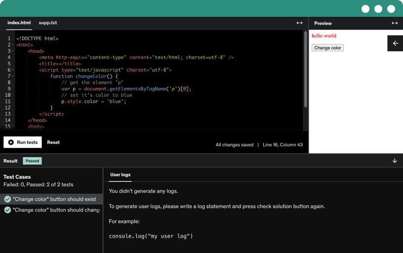
Course content
17 sections • 213 lectures • 24h 24m total length
Requirements
- A foundational understanding of HTML and CSS is all you need.
Description
Welcome to Tailwind CSS – The Practical Bootcamp
You will master Tailwind CSS from the ground up and transform your web development skills with hands-on coding exercises and real-world projects. Whether you’re just getting started or a seasoned developer looking to add Tailwind to your toolkit, this Bootcamp is designed to help you unlock your full potential and build stunning, responsive websites faster than ever.
In this Bootcamp, you’ll start by mastering the essentials of Tailwind CSS. I’ll guide you through the utility-first approach and teach you how to create beautiful designs with minimal custom CSS. You’ll build a deep understanding of core concepts like spacing, typography, and layout, and learn to leverage powerful features like flexbox and grid systems.
But this Bootcamp goes beyond the basics. You'll tackle interactive coding challenges that reinforce every lesson, giving you the opportunity to apply what you’ve learned and build real-world skills. You'll work on three major projects, including a professional portfolio website, a financial services website, and a band portfolio website—all designed to help you showcase your expertise and stand out in the job market.
Key Highlights of This Bootcamp:
Master the utility-first approach of Tailwind CSS for faster, cleaner, and responsive web design.
Engage in hands-on coding exercises after every lesson to practice and perfect your skills.
Build three professional-grade projects: a portfolio website, a financial services website, and a band portfolio website.
Learn to seamlessly integrate dark mode into your designs for modern, user-friendly interfaces.
Gain proficiency in powerful layout systems like Flexbox and Grid, and create complex yet scalable layouts.
Explore responsive design principles to ensure your websites look stunning on any device, from mobile to desktop.
Learn how to streamline your development workflow using Tailwind CSS tools like CLI and Preflight.
Comprehensive Code Documentation Included:
We understand that mastering new skills is not just about writing code—it’s also about being able to refer back to what you’ve learned. That’s why this Bootcamp includes thoroughly documented code for every lesson and project. Each section comes with well-organized, markdown-format documentation, ensuring you can easily review and reference key concepts and techniques.
With this detailed documentation, you’ll be able to:
Follow along effortlessly with each lesson’s code.
Quickly review essential concepts whenever needed.
Understand the 'why' behind every piece of code, enhancing your overall comprehension.
Keep these references handy for use in your own projects, long after the Bootcamp is over.
By providing clear, structured documentation, we ensure that your learning experience is seamless and that you leave the course with valuable resources to guide you through future projects.
Interactive Coding Exercises for Hands-on Learning
In this Bootcamp, I believe that the best way to learn is by doing. That's why we've included interactive coding exercises after essential lessons, designed to help you apply what you've learned and solidify your understanding of key concepts.
Through these hands-on exercises, you'll:
Practice immediately after learning: Reinforce your new knowledge by tackling real-world problems as soon as you complete essential lessons.
Build coding confidence: The exercises are structured to help you gradually increase your confidence and proficiency with Tailwind CSS.
Experiment with concepts: Push your creativity by experimenting with different utilities and layouts to fully explore the possibilities of Tailwind CSS.
Prepare for real-world projects: Each exercise prepares you for the more comprehensive projects you'll be building throughout the Bootcamp.
These coding challenges are an essential part of your learning experience, ensuring that you leave this Bootcamp with both the theory and practical experience needed to succeed.
Visualize Flexbox and Grid Layouts with Penpot:
Understanding layout systems like Flexbox and Grid is essential for mastering Tailwind CSS. In this Bootcamp, we take it a step further by using Penpot, an open-source design and prototyping tool, to help you visualize and experiment with these layouts before you write any code.
With Penpot, you'll:
See your layouts come to life: Visualize how Flexbox and Grid properties interact in real-time, helping you better understand how to apply them in Tailwind CSS.
Collaborate and experiment: Use Penpot’s powerful collaboration features to experiment with different layout structures and refine your designs.
Streamline your workflow: By planning your layouts visually in Penpot, you can transition seamlessly from design to code, saving time and ensuring precision in your final projects.
This added layer of visualization will make it easier to grasp the nuances of Flexbox and Grid, allowing you to confidently build complex, responsive layouts in your Tailwind CSS projects.
Projects in This Bootcamp
Project 1: Professional Portfolio Website
This project focuses on building a personal portfolio website to showcase your work as a developer or designer. You’ll learn to create a sleek, professional design that demonstrates your skills and experiences, complete with sections for projects, testimonials, services, and a contact form.
Key features of this project:
A fully responsive portfolio layout.
A hero section with an image and introduction text.
A projects section with a dynamic grid layout showcasing past work.
A contact form designed to collect inquiries professionally.
Project 2: Financial Services Website (Light & Dark Mode)
This project involves building a financial services website, a perfect practice in creating business-centric, professional websites. You’ll focus on creating a responsive website with light and dark modes, providing flexibility for users with different preferences.
Key features of this project:
A fully responsive design with two modes: light and dark.
Service sections showcasing various financial products and services.
A pricing table for customers to choose between different plans.
A client testimonial section with styled quotes and images.
A professional footer with contact information and social media links.
Project 3: Band Portfolio Website
In this project, you'll build a band portfolio website, showcasing an artist’s latest work, upcoming tours, and discography. This project is all about building a creative, visually appealing layout that grabs attention.
Key features of this project:
A hero section with the latest album or tour promotions.
Discography and gallery sections displaying the band’s albums and media.
A tour schedule showcasing upcoming events.
An interactive contact form for booking and inquiries.
What you'll master by the end of this Bootcamp:
Tailwind CSS essentials: Learn the utility-first approach and apply it to create beautiful, responsive websites.
Hands-on coding: Engage in interactive coding challenges after every lesson to solidify your understanding.
Responsive design: Build websites that look stunning on all devices, from mobile phones to desktop screens.
Dark mode mastery: Learn how to seamlessly integrate dark mode into your projects.
Real-world projects: Build professional-grade websites from scratch, showcasing your skills in a live portfolio.
Efficient workflow: Learn how to set up and streamline your development process using Tailwind CSS tools like CLI.
Mastering Flexbox & Grid: Use powerful layout systems like Flexbox and Grid to create complex, flexible designs.
Get Started Today
Whether you're starting from scratch or advancing your web development skills, this Bootcamp will provide you with the tools and knowledge you need to succeed. Take the leap and enroll today—your journey to mastering Tailwind CSS and building real-world projects starts here!
Who this course is for:
- Front-end developers eager to improve their styling efficiency and build faster, more maintainable websites using Tailwind CSS.
- Aspiring web developers who are looking to start building responsive and modern websites with a utility-first CSS framework.
- Experienced developers transitioning from traditional CSS to utility-first frameworks and seeking to enhance their workflow with Tailwind.
- Freelancers and entrepreneurs who need to rapidly prototype and deploy websites with optimized, scalable styles.
- Designers-turned-developers who want to bring their creative visions to life by mastering the design-to-code workflow with Tailwind CSS.