
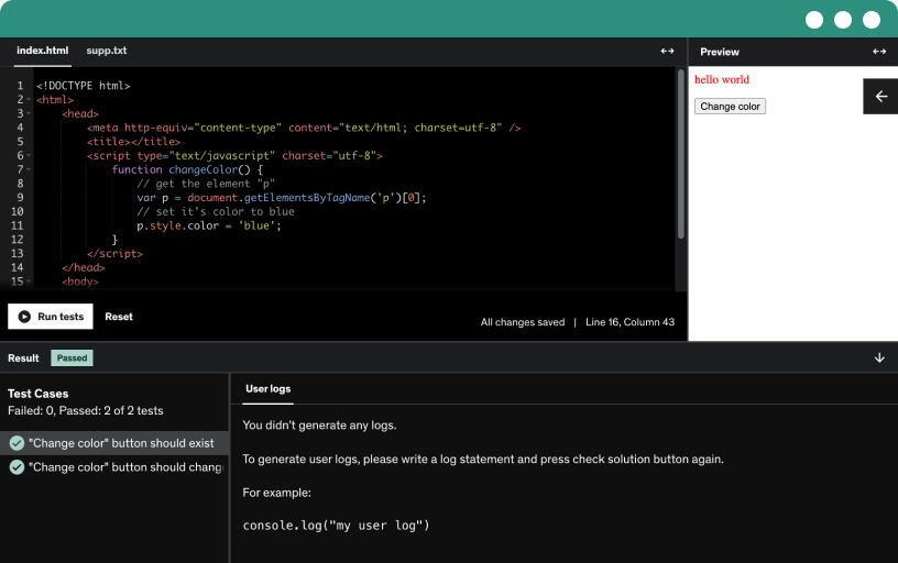
This course includes our updated coding exercises so you can practice your skills as you learn.
See a demo
Learn how to download and install Anaconda, a popular distribution for Python and R, which includes Jupyter Notebook and essential packages for data science.
Get introduced to Jupyter Notebook, an interactive web application that allows you to create and share documents containing live code, equations, visualizations, and narrative text.
Understand how to import essential Python libraries like Pandas and Matplotlib, which are fundamental for data manipulation and visualization.
Learn how to load CSV files into Jupyter Notebook, a crucial step for data analysis, and explore various methods for importing data.
Discover the use of Markdown for formatting text and learn how to comment out code in Jupyter Notebook to enhance readability and documentation.
Get an overview of the datasets you will be working with, understanding their structure, and the type of data they contain.
Explore essential Python methods that help you understand and analyze your datasets, laying the foundation for effective data analysis.
Learn how to rename columns in Pandas DataFrames to make your data more readable and easier to work with.
Understand how to select specific columns in a DataFrame, allowing you to focus on the most relevant data for your analysis.
Perform basic calculations on your data, such as mean, max, min, and sum, to derive meaningful insights.
Learn about standard deviation and count, two important statistical measures, and how to compute them using Pandas.
Use the describe method in Pandas to generate descriptive statistics, summarizing the central tendency, dispersion, and shape of your dataset’s distribution.
Analyze the frequency of unique values in your data using the value_counts method, helping you understand data distribution and identify patterns.
Discover how to work with indexes in Pandas DataFrames.
Learn how to sort values in DataFrames based on different criteria, enabling you to organize and analyze your data more effectively.
Understand how to access specific data points in your DataFrames using loc and iloc.
Explore advanced indexing techniques such as multi-indexes and slices, which allow for more complex data manipulations.
Transition from data manipulation to data visualization by learning how to create plots from DataFrames using Matplotlib.
Explore how to view unique values in a column with the unique and nunique methods, including handling nulls with dropna options and counting distinct postcodes, countries, and product subcategories.
Create a city column in the Airbnb data and set it to New York for all rows; then drop that column using labels and axis, with inplace to update.
Use the dataframe replace method to remove percent signs, apply regex, and normalize values, with examples like caps to hats and regions to West USA.
Learn to group data by a column with groupby, compute mean, max, or min, and extend to multi-column groupings like job title and location for salary insights.
We create bar plots of average salary in USD by experience level, convert the grouped data to a data frame, sort by salary, and add axis labels plus a title.
Explore scatter plots with the world happiness dataset, plotting happiness score against healthy life expectancy, using alpha, grid, labels, and color to reveal correlations and outliers.
Resize plots with plt.figure by setting figsize and dpi to control size and clarity. Create charts of date and price, high and low, with colors and side by side layouts.
Combine four plots into a 2x2 Matplotlib figure, customize styles, and format a line chart, horizontal bar, pie chart, and bar chart for sales by month.
Create a multi-plot figure from a data frame, combining a line chart, histogram, and horizontal bar in a 2x2 layout, with labeled axes and a crime over time title.
Create and load database schemas for classic models and Netflix data using SQL scripts, drop and recreate schemas, and import CSVs to practice data manipulation.
Explore the Netflix relational schema through an entity relationship diagram, uncovering primary keys, foreign keys, and table relationships like titles, show country, cast, directors, and categories.
Apply multiple filters using in and not in to select records based on a list of values, such as release years 2020 or 2021 and date added.
Extract unique values with distinct from single or multiple columns, illustrated on Netflix titles. Order results by release year or type in ascending or descending order.
Explore inner joins by combining rows from two or more tables on a common key, returning only matching records, illustrated with Netflix titles, show director, and director ID.
Master left joins in SQL by retrieving all records from the left table with matched right-table data, handling nulls, and comparing behavior to inner joins through practical examples.
Explore how group by aggregates data by a selected column, enabling daily revenue sums and per-customer last and first orders, with counts of distinct orders.
Learn how to use subqueries in SQL to create derived tables, alias results, and compute aggregates like average payments per day, enabling nested queries and advanced data retrieval.
Segment customers by purchase value using a case statement. Compute total from orders and order details, then classify as high, medium, or low value and left join to customers table.
Are you interested in starting a career in data analytics but have no experience? Become proficient in essential tools such as Python, SQL, Tableau, and ChatGPT with this beginner data analyst course, designed to prepare you with the skills necessary to tackle real-world challenges as a data analyst. Whether you are looking for a career change to a data analyst, or have some experience and want to build on it, this step by step course will help guide you.
What You Will Learn:
Python for Data Analysis: Start from the basics and advance to complex data manipulations with Pandas and Matplotlib.
SQL: Learn to manage and query databases efficiently, from simple commands to complex queries.
ChatGPT for Productivity: Enhance your coding and analysis efficiency with optimized ChatGPT prompts.
Tableau for Visualization: Create impactful visualizations and prepare to become a Tableau Certified Data Analyst.
Hands-On Projects: This is a project-based data analyst course - from analyzing LA crime statistics to exploring sales trends, apply what you've learned in practical projects.
Why This Course?
Comprehensive & Practical: Gain hands-on experience with real-world projects that prepare you for the job market.
Accessible to Beginners: No prior experience? No problem! We cater to all skill levels.
Flexible Learning: Study at your pace with lifetime access to all course materials.
Who Should Enroll?
Aspiring data analysts, career switchers, and professionals aiming to upskill in data analysis and visualization.
If you're ready to start your journey in data analysis, enroll now and begin transforming data into insights!