
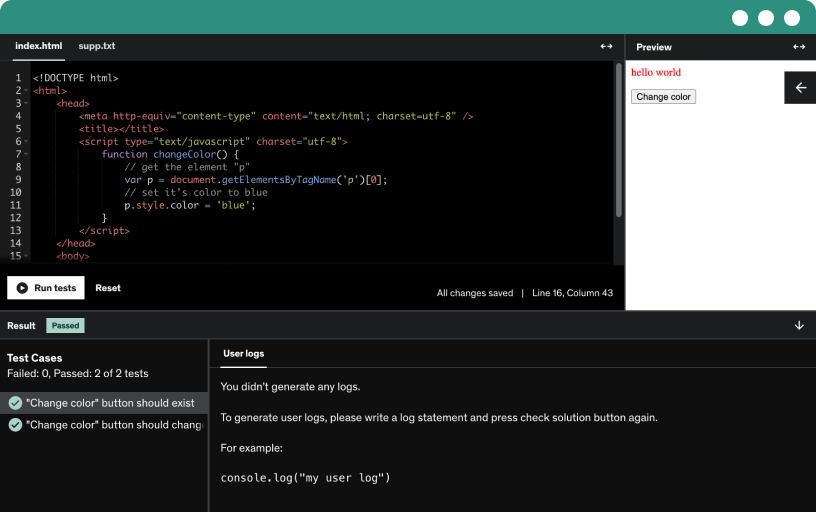
This course includes our updated coding exercises so you can practice your skills as you learn.
See a demo
In this video, you’ll get an overview of what to expect from Python for Intermediate. I’ll walk you through the course structure, key learning objectives, and the skills you’ll gain by the end of this program. Designed for those who have a basic understanding of Python, this course focuses on helping you tackle more advanced concepts such as data manipulation, working with libraries, error handling, and problem-solving techniques used in real-world projects.
You’ll also learn how to write efficient, clean, and scalable Python code while applying best practices that are essential for professional development. Whether you're preparing for a career in tech, enhancing your current skill set, or working on personal projects, this course will provide the tools and guidance you need to grow as a Python developer.
Let’s get started and take your Python expertise to the next level!
In this lecture transcript, the speaker provides a comprehensive guide on working with real world data using pandas. They cover reading CSV, JSON, and Excel files, handling missing values, cleaning and converting data types, and preparing data for analysis and modeling. The transcript demonstrates how to read and explore different file formats, detect and handle missing values using methods such as dropping rows, filling with constants or averages, and forward fill. The speaker also discusses the importance of preserving data set size and using specific methods based on the nature of missing values. This lecture provides a practical approach to data cleaning and preprocessing using pandas, essential for data analysis and machine learning tasks.
The lecture covers data cleaning essentials focusing on removing duplicates, detecting and handling outliers using the IQR method, and data type conversion. Removing duplicates is essential to avoid skewed analysis results and issues in visualizations or machine learning models. Outliers, values significantly higher or lower than others, can distort averages and trends, addressed using the IQR method. Data type conversion involves converting column types, such as dates or categorical data, for analysis. Practical examples and code snippets demonstrate how to implement these techniques in real-world projects across industries like finance, e-commerce, healthcare, and machine learning. The session emphasizes the importance of thorough data cleaning practices to ensure accurate and meaningful analysis outcomes.
The lecture discusses the importance of data type conversion when working with real-world data sets, emphasizing the need for accurate calculations, reduced memory usage, and compatibility with various libraries. It guides through practical examples of converting string to number, extracting digits, handling missing values, and converting floats to integers. Techniques include converting a date column to a datetime object, extracting and converting product IDs, categorizing data types, converting quantity and price columns, and formatting a discount column as a percentage string. Through step-by-step demonstrations using pandas functions, the lecture illustrates smart data type conversions to improve memory efficiency and overall performance, preparing the data for tasks like data cleaning and machine learning model training. The session concludes with insights on visualizing the transformed data set for further analysis.
This lecture introduces the importance of data visualization using Matplotlib and Seaborn in Python to derive insights from raw data. It covers topics such as creating line plots, bar charts, customizing plots with colors and labels, and storytelling through visual representations. Practical examples include visualizing sales trends, student code distributions, and COVID-19 data comparisons. The lecture delves into Matplotlib basics, explaining figures, axes, and plotting, and demonstrates creating simple line plots and advanced visualizations to show daily and monthly sales trends. The importance of data structuring for clearer visualizations is emphasized, highlighting the impact of data preparation on visualization effectiveness. The session concludes by hinting at exploring more advanced visualization types like histograms and scatter plots in the forthcoming sessions.
The lecture covers the creation of bar charts to compare quantities across categories by grouping data and plotting results using Python. It demonstrates customizing bar charts with value labels and color mapping for better aesthetics. Afterwards, it delves into histograms, illustrating how they display the distribution of numerical variables by grouping values into intervals, unlike bar charts. A histogram example is presented for product prices, showing how to plot and interpret frequency distribution. The distribution appears fairly uniform with a slight peak around the 400 price range. Histograms are highlighted as powerful tools for visualizing data distributions, identifying patterns, clusters, and outliers. The session concludes by mentioning further enhancements such as adding mean or median lines, adjusting bin sizes, and incorporating color encoding or annotations for more comprehensive analysis.
The lecture introduces box plots as a visual tool to understand data distribution and outliers. Explaining the five key points of a box plot (minimum, quartiles, and maximum), it demonstrates how to read and create box plots in Python using Matplotlib. The session covers customization options for enhancing box plots, such as adjusting figure size, colors, markers, and notch display. Additionally, it showcases how to plot multiple box plots side by side for comparison. Emphasizing the importance of box plots in identifying outliers and visualizing data spread effectively, the lecture encourages further exploration of visually appealing plots beyond box plots. By mastering box plots in Python, one can gain insights into data patterns and make informed analytical decisions.
The lecture introduces scatterplots as visual tools to depict the relationships between two numeric variables. Examples include studying hours versus exam scores, ad spend versus sales revenue, and product price versus purchases. The process of creating scatterplots using Python libraries like Matplotlib, NumPy, and Pandas is discussed. Through step-by-step demonstrations, the lecturer showcases the creation of scatterplots, adding trend lines, annotations, and making aesthetic adjustments for enhanced visualization. The importance of scatterplots in identifying trends, clusters, outliers, and relationships, whether linear or non-linear, is emphasized. The session concludes with a reminder to stay curious, practice visualizations, and look forward to more exciting data exploration in upcoming sessions.
The lecture provides an in-depth exploration of line charts, emphasizing their utility in visualizing data trends over time. Line charts connect data points with lines, facilitating the observation of trends, patterns, and fluctuations. Demonstrated through code examples, line charts are especially valuable for time series data analysis, such as stock prices or website visitors per day. The lecture covers techniques for creating single and multi-line line charts, emphasizing the significance of color, markers, and line styles in aiding data interpretation. The practical applications of line charts in various fields like stock market analysis, climate data tracking, and business analytics are highlighted. Emphasizing the importance of understanding change over time, the lecture encourages prioritizing the timeline and expected patterns while choosing visualization tools. Lastly, the lecture advocates for utilizing line charts to reveal insights and make informed decisions based on evolving data trends.
In the lecture, the importance of summary statistics in exploratory data analysis (EDA) was emphasized. Summary statistics serve as a quick snapshot of large datasets, revealing central tendency, variability, and outliers. By condensing data into interpretable values, summary statistics aid in understanding data quality, spotting anomalies, and guiding visualization choices. For numerical columns, summary statistics provide the five-point summary along with count, mean, and standard deviation. For categorical columns, it includes count, unique values, mode, and frequency. These insights help in identifying data quality issues, making informed decisions on data cleaning, and selecting appropriate visualization methods. Real-world applications in e-commerce, finance, and healthcare demonstrate the significance of summary statistics in extracting valuable insights from data before diving into in-depth analysis.
The lecture transcript covers the functionalities and significance of group by, pivot tables, and correlation analysis in data analysis using pandas. Group by is essential for splitting data, performing calculations, and identifying patterns within different categories. Pivot tables help summarize and compare data across multiple categories efficiently. Correlation analysis measures linear relationships between numerical variables, aiding in identifying key drivers and relationships in the data. Practical examples and use cases are discussed for each method, showcasing their importance in exploratory data analysis. The lecture emphasizes the power of group by for data summarization and insights generation, highlighting its crucial role in data analysis. The exploration of pivot tables and correlation analysis further enhances data summarization and pattern identification, making data analysis more intuitive and insightful.
In this lecture, the speaker delves into the concept of pivot tables, a powerful tool for reorganizing and summarizing data to derive meaningful insights without altering the original dataset. The session focuses on creating pivot tables in Python Pandas, offering flexibility and efficiency compared to Excel. The transcript covers the syntax and usage of pivot tables, illustrating a step-by-step guide on how to create pivot tables, perform aggregations, and visualize data through heat maps. By analyzing sales, quantity, and discounts across different regions, categories, and months, pivot tables allow for quick comparisons and identification of trends. The speaker highlights the importance of pivot tables in generating sales reports, performance metrics, and trend analysis, emphasizing the value of structured and compact views for deeper explorations and actionable insights. The session concludes by hinting at forthcoming sessions that will delve deeper into visualizations, trend analysis, and deriving business insights from aggregated data.
Correlation analysis is crucial for understanding relationships between numerical variables in data sets. It measures the strength and direction of these relationships, helping guide business decisions, machine learning, risk reduction, and data exploration. Using tools like the Pearson correlation coefficient and visualizations like heat maps, correlations can be identified, such as strong positive links between variables like advertising spend and sales. Different correlation types like Spearman and Kendall cater to various data scenarios, highlighting the importance of selecting the right method based on data characteristics. However, it's essential to remember that correlation does not imply causation and is sensitive to outliers. Through practical demos and interpretations, the lecture emphasizes how correlation analysis can be applied across industries like finance, marketing, healthcare, and sports to gain valuable insights and make informed decisions.
Data transformation is crucial in exploratory data analysis (EDA) to prepare raw data for analysis or machine learning models by adjusting scales, handling categorical variables, and enhancing relationships. Techniques like normalization, standardization, and encoding are essential for making data comparable and structured. In a Python demo, MinMaxScalar is used to normalize numerical data, bringing values into a common scale of 0 to 1, aiding various machine learning algorithms. Normalization prevents one feature from dominating others, improving model convergence and accuracy. Data transformation acts as a bridge between raw data and valuable insights, mitigating biased models, incorrect comparisons, and weak analysis. By understanding and effectively applying data transformation techniques, analysts ensure fair scaling, proper handling of categories, and improved data relationships, paving the way for more accurate and efficient data analysis and model building.
The lecture discusses the importance of data transformation in machine learning, focusing on scaling techniques such as normalization and standardization, and encoding categorical variables. Normalization rescales features to a fixed range, while standardization centers data around the mean and standard deviation. These techniques ensure fair comparisons and model compatibility. Encoding categorical variables is vital for machine learning models that require numerical inputs. Methods like label encoding and one-hot encoding are explained, with label encoding suitable for ordinal data and one-hot encoding for nominal data without a specific order. The lecture emphasizes that data transformation is essential for preparing data for analysis, improving model accuracy, interpretability, and reliability. It also highlights how data transformations uncover hidden relationships and enhance comparisons across features, contributing to effective data analysis and machine learning outcomes.
The lecture discusses the importance of saving trained machine learning models for reuse in production applications and how to do so using tools like Joblib with examples in scikit-learn. It covers creating a dummy linear regression model, saving it to disk, loading it back, and making predictions. The transcript also includes code snippets for data preparation, model training, and visualization of model performance using metrics like root mean squared error and R-squared. Key takeaways include understanding the need for model persistence, efficient saving methods for different scenarios, and insights into evaluating and visualizing model performance through residual plots. The session provides a practical guide to handling machine learning models beyond training and explores essential concepts for model deployment and utilization.
In this lecture, the instructor covers building and training a linear regression model in Python to predict house prices. The process involves creating synthetic data, splitting it into training and test sets, fitting the model, and evaluating it using metrics like mean squared error and R squared score. The lecture explains the significance of these metrics in assessing the model's performance and understanding the variation in house prices explained by the features. The demonstration provides a hands-on experience in predictive modeling, showcasing how linear regression can be applied to real-world problems effectively. The session sets the groundwork for advanced modeling techniques and hints at exploring classification models in upcoming sessions. The linear regression model demonstrated showcases how data science concepts can be practically implemented to solve predictive problems, making the learning journey into machine learning exciting for participants.
The lecture focuses on using logistic regression for a binary classification problem of predicting customer churn in a telecom company. The process involves data splitting, model training, prediction, and evaluation using metrics like accuracy, precision, recall, and confusion matrix. The model achieved 45% accuracy, indicating room for improvement. Suggestions for enhancing the model include improving data quality, addressing class imbalances, exploring advanced models, hyperparameter tuning, and refining evaluation strategies. The importance of understanding the end-to-end process of transforming raw data into valuable predictions is emphasized. The lecture concludes by highlighting the significance of continuous learning and exploring advanced machine learning techniques to address real-world business challenges effectively.
This course is designed for learners who have a basic understanding of Python and want to advance their skills with more complex concepts and practical applications. You’ll explore object-oriented programming, file handling, error management, and working with popular Python libraries to build efficient and scalable code. The course emphasizes hands-on learning, with real-world projects that help you apply what you learn in meaningful ways.
Throughout the course, you’ll work with data structures, automation scripts, and data manipulation techniques that are widely used in data science, machine learning, and software development. You’ll also learn how to write clean and reusable code, troubleshoot issues, and optimize performance for faster and more reliable results.
By the end of this course, you’ll be comfortable tackling intermediate programming challenges and developing Python solutions for practical problems. This course is ideal for students, professionals, and hobbyists who want to bridge the gap between beginner-level knowledge and advanced Python applications.
Whether you’re aiming to work on data-driven projects, enhance your problem-solving skills, or prepare for more advanced programming courses, Python for Intermediate gives you the tools, techniques, and confidence to grow as a Python developer and pursue exciting career opportunities in technology-driven fields.
Join now and take the next step toward becoming a proficient Python expert!