
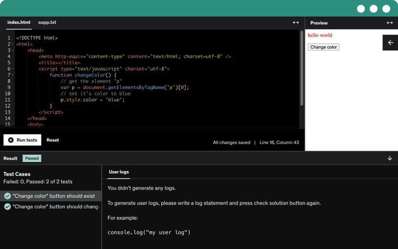
This course includes our updated coding exercises so you can practice your skills as you learn.
See a demo
Learn to use Materialize to build responsive web pages by applying layout, colors, and typography. Explore 12 UI components, 15 JavaScript components, and 9 form components, with three practical projects.
Explore materialize, a free open source framework focused on user experience, with 45 UI components built with SAS, based on material design, and learn to create component variations.
Explore the materials learning kit to grade 45 UI components, preview code, copy and run examples, and practice responsive grid with the breakpoint tool across layouts.
Learn how to download, install, and verify the materialise framework, include the css and javascript files, set up folders, and integrate material icons for a working start.
Learn styles for changing layout, applying colors, and building responsive grid systems and typography; explore nine components in this CSS section.
discover materialize's color palette based on material design base colors, using base color classes with optional light, dark, and accent variants for background and text.
Learn how to build a fluid, responsive 12-column grid with materialize using containers, rows, and columns. Explore padding, offsets, and push-pull techniques across breakpoints s, m, l, and xl.
Learn to use Materialize helper classes to control alignment, text alignment, floats, and responsive show or hide across breakpoints, plus truncation, shadows, and browser-default styles for lists, selects, and inputs.
Learn to use css classes to build responsive media, including images that adapt to the parent width, circular images, and videos that maintain aspect ratio through responsive embeds.
Learn to implement a pulsing effect on a floating button with a menu icon, using Material icons and button techniques, and preview the result in the browser.
Learn to apply material design shadows using set depth classes from 1 to 5 and remove shadows with set depth 0, demonstrated on teal car panels with white text.
Master styling tables with basic, striped, highlighted, centered, and responsive layouts. Build tables using thead, tbody, tr, and td, and make headers stay visible on small screens.
Master scale transitions for a floating button by using data scale in and data scale out attributes with JavaScript to toggle scaling classes.
Learn typography by styling headings from h1 to h6, creating red-bordered block quotes, and enabling flow text with responsive font sizes and weights (default, light, thin) for headings and paragraphs.
Build a set of twelve reusable interface components—badges, buttons, breadcrumbs, navigation, and more—exploring their usage and the variations you can apply.
Learn to create badges with batches, numbers, and captions, customize background colors, and apply them to collections, dropdowns, a math bar, and collapsibles, including custom captions via data patch caption.
Create and customize race, floating, flat, and text buttons with small and large variations, apply color classes, include a material icon, and handle disabled states.
Demonstrate breadcrumbs as a navigation aid showing location in a web hierarchy, featuring a three-link breadcrumb with an active item and separators built in code and tested in the browser.
Explore how to design and implement versatile cards in Materialize, including basic, image, horizontal, and reveal variants; customize with floating action buttons, tab interactions, and panel styles.
Explore how to build collections by grouping list items with borders, links, headers, secondary content, and avatar content. Implement active states, hover effects, and avatar variations using images or icons.
Learn to implement a floating action button that reveals actions in various directions and expands into a toolbar, with click-to-open behavior and icons like bold, italic, and underline.
Learn how to structure a page footer using flexbox to stay at the bottom, including a sticky variant, while organizing content with header, main, container, and responsive columns.
Learn to use materialize icons from google and display material design icons with the material-icons class, while sizing with tiny, small, medium, and large classes.
Create a responsive navigation bar component wrapped in the nav element, with logo, links, icons, and active states, plus collapsible mobile menus, taps, dropdowns, and a floating action button.
Create a pagination component that splits datasets into pages for easy reading, shows size and progress, and uses material icons for left and right arrows with disabled and active states.
Explore the preload component to display determinate and indeterminate progress with linear and circular styles, and learn to vary sizes and colors, including a circular flashing colors variation.
Build a table of contents as a list with an active item and optional JavaScript scrolling. Apply the table of contents class and activate anchors with a red left border.
Explore how to build 15 JavaScript components, including carousels, dropdowns, modals, taps, and more, and learn reusable patterns for interactive user interface visuals and effects.
Auto init shows how a single function call initializes all Materialize JavaScript components, enabling carousel, dropdown, and tooltip to work automatically after adding the script.
Discover the carousel component by building image, content, and fixed-item carousels with adjustable visible items, wrap options, and indicators. Initialize with JavaScript to switch slides and create full-width sliders.
Create accordions using collapsible components that expand and collapse content, switch between single and multiple open sections, set an active state on load, and apply pop-out style.
Learn to build a dropdown using a button trigger with items, dividers, and icons, and configure it to open on click or hover through basic JavaScript initialization.
Learn to implement a feature discovery component with trigger buttons and a bottom-right fixed action button, wiring data attributes, initialization scripts, and open/close controls.
Use the media JavaScript component to create a material box lightbox and a captioned image slider, with optional indicators and full-screen mode, initialized via JavaScript.
Explore modals for dialogs, bottom sheets, and fixed content, triggered by links or buttons, with close controls, escape key support, and JavaScript initialization.
Parallax moves the background at a different speed than the foreground during scrolling, demonstrated with an image wrapped in parallax containers and initialized via a script.
Learn to use the push pin plugin for fixed positioning to pin elements during scroll, with offsets, top alignment, and one-at-a-time navigation bars inside frames.
Explore a scrollspy plugin that tracks which section is centered, supports offsets (200 px and 0), updates a fixed table of contents, and enables smooth scrolling to sections via JavaScript.
Master a slide-out left side navigation with a toggle button and overlay, featuring a basic and a fixed version that adapts to screen width and uses data-target triggers.
Explore the tabs component to create a horizontal taps menu that shows content per tab, with an active tab on load, overflow scrolling, and swipeable, fixed width options.
Learn to implement unobtrusive toasts that auto fade, dismiss by drag or button, configure display length and activation percent, insert custom content, and style them for polished notifications.
Learn to create tooltips that provide small textual hints for icons and buttons, position them top, bottom, left, or right, and customize appear and disappear delays using a JavaScript setup.
Apply the waves effect to buttons and circular floating buttons using the waves class, and explore color options like red, yellow, orange, purple, green, and teal.
Explore the forms section to learn how to use nine form components for collecting user data, including auto complete, checkboxes, chips, pickers, radio buttons, range select, switches, and text inputs.
Implement an autocomplete input that suggests country names as you type, filters the list, supports keyboard navigation, uses a data array of countries, and can include optional images.
Explore how to implement and customize checkboxes in a Materialize course, including basic and field in variations, pre-checked states, disabled options, and indeterminate state controlled by JavaScript.
Explore how to implement chips using Materialize: display contact chips with images, delete functionality, chips input with placeholders, initial chips, and autocomplete for country options.
Explore date picker and time picker components in materialize, customize format, disable weekends, set the first day, enable 24-hour time, and initialize via JavaScript.
Explore radio buttons by building single-choice groups with checkable, pre-checked, and disabled states, learn labeling, grouping with the name attribute, and styling variations.
Explore range inputs with single and dual handles using native HTML range and the No UI slider plugin, initialize with start values, min and max, and display live values.
Learn to build and customize select inputs with labeled options, single and multiple selections, option groups, icons, and disabled states, with JavaScript initialization and browser-default options.
Turn checkboxes into binary switches. Wrap a label around an input with class switch and a span with class lever, and include a disabled state.
Learn to create and customize text inputs and text areas with Materialize, including floating labels, helper texts, icon prefixes, and character counts, plus single and multiple file inputs with validation.
Build a multi-section page using the materials framework and icons, featuring about, work experience, education, testimonials (carousel), contact info, portfolio, and skills, with a responsive two-column layout.
Establish the basic project setup, specify the character set, enable responsive layout, and link to materialize CSS while using a defer script tag for font awesome icons.
Create the about section inside a container, center the content, set the page background color, and build a responsive card with an image, title, flow text, and a centered quote.
Create a work experience section with Materialize, using icons, headings, and time tags with dates for each job with left-right floats. Apply custom CSS to fix margins and padding.
Copy and customize the education section by duplicating the previous section, update headings and texts, switch to solid group icons, and feature five items linked to Stanford, Harvard, and Berkeley.
Develop a testimonial carousel with five items, center-aligned content, and a gray background with light gray variations, then adjust padding, margins, and initialize the JavaScript carousel with indicators.
Create the contact info section in the second column using a Materialize avatar collection, with icons and a message form, including tel, email, address, and a submit button.
Reuse the contact info code to build a portfolio section, updating text and icons to display social links. Copy and paste steps refine YouTube, Vimeo, Instagram, and Stack Overflow icons.
Demonstrates building a skills section with headings, icons, and determinate progress bars to display proficiency in coding languages and frameworks, frontend tools, and WordPress, Drupal, and Joomla.
Build a responsive small business website with the csx framework, including index, services, about, team, and contact pages, featuring a hero section, hiring message, language selector, and embedded maps.
Set up the index page with doctype, html language and direction, charset, and viewport tags; include material icons, local materialize css, materialize js, and note the image folder.
Create a responsive navigation with a brand logo, menu, language dropdown, and a burger icon that reveals a left sidebar; initialize the dropdown and sidebar with JavaScript.
Create a responsive hero section using Materialize, with a red background, a two column grid on desktops, a centered container, white text, a left image, and a read more button.
Create the hiring section with a yellow card panel inside a container grid, featuring an 'we hiring' heading and the final project's copy.
Create the what and who section with a nested responsive grid that stacks on small screens and becomes two-column at large breakpoints, including image, text, and a read more button.
Learn to build a responsive news grid with materialize cards, using a 12-column layout on small devices that becomes 6 on large and 3 on extra-large, dates and read more.
Create the final home page photo section using a nested four-column grid that becomes two columns on medium and large devices, including quick links, information, address, phone, email, and copyright.
Create and configure the services page with a responsive two-column grid, swapping order of service items using push and pull on medium devices.
Duplicate the services template to create the about page, set our story heading, update the title and active nav, and compose three paragraphs in a full-width twelve-column layout.
Create the about office section using a data row layout, a twelve and l six grid, a responsive image with an italic caption, and custom styling via the italic class.
Build a responsive clients grid that starts with two columns, then switches to three at medium, and finally to six at large for a 12-column layout; include responsive images.
Create the team page by duplicating about page and updating the title to company name, team, then build a grid of twelve circular avatars linked to Twitter and LinkedIn.
Create the contact page's address section using a two-column grid, update the page title to company name dash contact, and display address, phone, and email in a clean layout.
Create a two-column grid showing opening hours with times aligned to the right, detailing Monday 10 a.m.–6 p.m., Friday–Saturday 10 a.m.–10 p.m., and Sunday 10:00 a.m.–8:00 p.m.
Create a responsive contact form with a nested grid, featuring message and map sections that become two columns on extra large screens, using materialize inputs, icons, and initialized department select.
Embed a responsive Google Map on the contact page by sharing a location in Google Maps, copying the iframe code, and wrapping it in a 16:9 container.
Create a three-page knowledge base with front page, category page, and article page, featuring breadcrumb, search, page navigation, and responsive, scrollable layouts.
Learn the basic setup for a Materialize project, including the duct tape declaration, linking the Material Icons font from Google, an empty title tag, and wiring in JavaScript and images.
Create the top bar with a brand logo linking home, a language dropdown on smaller screens, and a burger icon that reveals a left sidebar for responsive navigation.
Build a full-width search component below our chopper, using a grid with a single column, a left search icon, a button, and a floating label input.
Create a responsive article section with a heading, grid of cards, and images that adapt from one column on mobile to two on tablet and full width on desktop.
Create a centered footer on the index page with inline icons and white text on a red background. Include home, tutorials, and contact links plus a copyright line.
Create breadcrumbs for the category page before the search component. Make a two column grid on medium devices and duplicate index file for category, updating title to category heading.
Build the page navigation in the left column with a subcategory heading and links for each subheading. Implement push pin, scroll spy, and smooth scrolling to enhance navigation.
Create a category article list with five items, implementing smooth scrolling, scroll spy, and a sticky pushpin navigation, while handling a responsive two-column layout and dynamic width adjustments.
Position the final column in a three column grid. Hide on small devices, enable push-pin sticky behavior, and include a technical support card with a contact support button.
Create the final article page, duplicate category page as article dot hmo, update the title to article heading, adjust breadcrumbs, and add a breadcrumb item linking to the article page.
Update the page navigation by locating the relevant component, change the text to in this article, and set the subheading to article subheading, then go back and refresh.
Demonstrates building the article content with headings, date, paragraph, a light yellow panel, lists, images, code samples, and a striped table within a responsive two-column layout.
Create a feedback section beneath the article with a form, legend 'was this article helpful', yes/no radio inputs, a comments text area, and a submit button.
Create a right-column related articles section by building a cut panel with a collection of anchor links, and make it sticky inside the site tech using the push pen class.
ABOUT
Materialize - one of the world's most popular front-end frameworks!
This course covers all the different parts of the latest version of one of the world's most popular front-end framework, Materialize 1.0.0. Materialize has been used by thousands of people around the world and have been carefully developed to cover a wide range of typical user interfaces.
Web pages built with Materialize works across all kinds of devices, browsers and screen sizes and will have a clean and modern design.
This course is for the beginner who want to learn Materialize from the bottom up. It goes through all the different parts, but each lecture can be watched independently.
In addition to just learning about the different parts of Materialize you will find a detailed walk-through of how to build three different responsive and modern complete projects using only Materialize.
PROJECTS
Learn to build the following projects using Materialize:
Project 1: Resume and CV Page
Project 2: Small Business Website
Project 3: Knowledge Base
LEARNING STYLE
More than just video lectures
In addition to the video lectures this course contains the following kinds of learning materials:
19 coding exercises:
A total of 99 automatic tests against your code. This is one of the best ways to learn how to code - no downloads or installations required.
Materialize Learning Kit:
Downloadable ZIP file that works offline
A custom built learning kit with source code for all parts of Materialize. Features a reference section with many examples and a practice section, which you can use while learning about Materialize. More than 100 source files included in this learning kit.
UPDATES
Upcoming future updates for this course will include the following:
New projects will be added: online shop, social network, portfolio, CMS admin, dashboard and more...
New components, utilities and other features in future versions of Materialize will be added
Advanced section on how to customize Materialize with Sass
Quizzes and assignments