

Your cart is empty.
Keep shoppingHTML CSS Easy steps to create a web template from scratch
22,369 students
HTML CSS Easy steps to create a web template from scratch
Complete easy to follow guide to create your own web template using HTML and CSS Quick Crash course for beginners
Created byLaurence Svekis
Last updated 11/2024
English
English [Auto],
What you'll learn
- create HTML and CSS web templates
- write HTML code
- write CSS code
Explore related topics
Coding Exercises
This course includes our updated coding exercises so you can practice your skills as you learn.
See a demo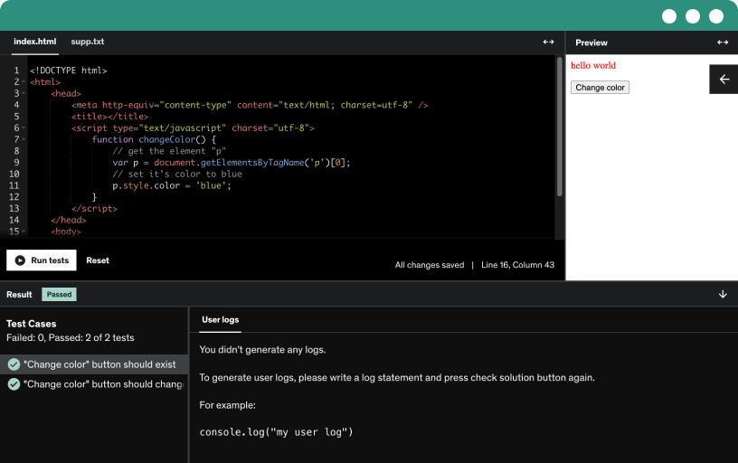
Course content
2 sections • 16 lectures • 1h 1m total length
Requirements
- computer access
- desire to learn
Description
Beginners course, this is perfect for anyone starting out and looking find a starting point to develop website.
Crash course to learn how to create HTML and CSS web templates. HTML5 web template design from scratch.
Learn to create your own web template from scratch in 1 hour!!!
This course is designed for anyone who wants to better understand how to create their own websites, within this course we show you how to make a basic web template from scratch. You can reuse and update this template to make unlimited websites.
Step by Step guide
- Learn how to create HTML code
- How to structure an HTML5 web template and common tags.
- Add a nav bar for navigation explained
- connect HTML and CSS ids, classes and tags
- Box model explained
- Floats and fixed width
- Make it RESPONSIVE and mobile ready
This course is designed to be easy to follow along, its encouraged to practice the code being presented through out the course. Resources, source code, and everything you need to learn to make websites is provided. Start with simple HTML structure as we explain how it integrates with CSS.
Learn about web design and its core concepts and much more.....
We walk you through step by step with detailed explanations of code and more.
- quick lessons get right to the point
- fully covered topics with real world examples
- source files downloadable to work along
- challenges and lessons and code samples
- code snippets
- Links to top resources to save time
- 30 day money back guarantee
- new course material added regularly
- trusted name in education since 2002
- full HD easy to read source coding
- quick response support to students
- regular discussions
We teach you the latest techniques and tools to use in order to create amazing web content. Everything you need to know is included in this course. Learn at your own pace, lifetime access to this course.
Who this course is for:
- anyone who wants to create websites
- web developers
- anyone who wants to learn HTML and CSS
- learn HTML and CSS
- web developer beginners