
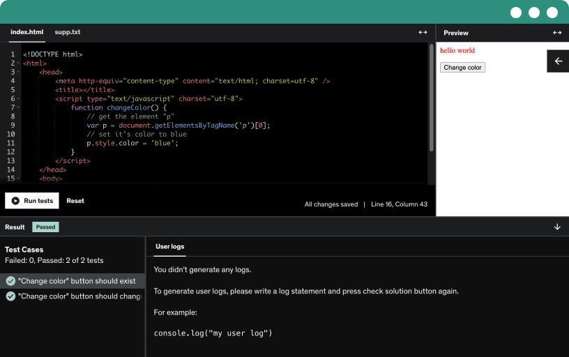
This course includes our updated coding exercises so you can practice your skills as you learn.
See a demo
Master foundation 6.5 by building its components with a custom learning kit. Create three projects: a resume and CV page, a small business site with five pages, and a knowledge page with three pages.
Explore foundation version six point five, an open source responsive front-end framework, and learn about its 47 UI components, categories like general, forms, typography, and how variations empower prototyping.
Explore the foundation six learning kit to master components, categories, and responsive layouts with breakpoints, practice coding in the playground, and copy and apply code to build with foundation.
Download foundation 6.5 from the official site, install the complete package, unzip, and explore the index, css, jquery, and app.js files; initialize foundation with a getting started template.
Download a customized foundation version from the official site, unzip the custom built bundle, verify the default installation with doctype, jQuery, and app.js initializing foundation.
Install Font Awesome 5 to add extra icons, download the free web assets, include the JavaScript file with defer, and prefix icons with FAA- to use solid and brand icons.
Explore the foundation xy grid, a responsive x y grid system with gutters, grid containers, auto sizing, offsets, collapse options, vertical grids, and nested grids for flexible layouts.
Learn to build forms with input labels, text areas, selects, checkboxes, radios, and field sets, then style with a grid layout and add file upload and custom control labels.
Discover Icahn's foundation icons pack (283 icons), install them in your project, and insert icons with the i tag and a foundation class to control color and size.
Explore prototyping utilities that style components with utility classes—radius, borders, shadows, arrows, separators, typography, and list options—plus text transformation, decoration, truncation, wrapping, and display and positioning controls.
Explore prototyping utilities for margins and padding, apply multi-side spacing, adjust width and height with max constraints, and use border box, display, position, overflow, and flex utilities.
Master flexbox utilities to turn elements into flex containers, control horizontal and vertical alignment, flex direction, grow and shrink behaviors, and responsive order across breakpoints.
Master visibility classes to show or hide content by screen size, orientation, and screen readers; implement skip links for accessible focus.
Master Foundation 6.5 float utilities to align elements left, right, or center using auto margins, with clear fixed to maintain the document flow, demonstrated in practice.
Master foundation typography using semantic markup to style paragraphs, headings, lists, quotes, code, and keystrokes without relying on classes.
Learn to create and customize buttons with anchor and button elements, covering sizes, colors, hollow and disabled styles, clear buttons, dropdowns, and icon options.
Learn to create and customize button groups with sizing, color options, and full width layouts, control stacking by breakpoints, and implement a split button with an icon.
Learn to implement a close button that removes the parent element, using data-close attributes, accessible aria-label, and optional motion UI slide-out animation for a call out.
Create basic sliders and range sliders with step control, vertical layouts, and disabled states. Implement two-handle ranges, data bindings, and nonlinear value translation, plus a native range input.
Explore how switches serve as an alternative to checkboxes and radio buttons, with single-select groups, sizes from tiny to large, and optional yes/no inner labels for accessibility.
Explore building flexible menus with basic, vertical, and nested styles, including right, center, and expanded alignments, active states, text items in bold, and icon placements left, right, top, or bottom.
Explore horizontal and vertical dropdown menus with single and multi-level nesting, including hover-to-open and click-to-open options. Learn to initialize with data attributes and adjust closing times to tailor behavior.
Master drill-down menus for mobile by exploring vertical navigation alternatives to drop-downs, with nested menus, auto height, parent links, and features like scroll to top and close on body click.
Create and customize a Korean-style accordion menu with triggers for submenus, indented nested items, active states on load, and single-open panes to prevent multiple sections from opening.
Build a responsive top bar with left and right sections, a left menu, and a right search input with a button, with stacking that adapts from small to extra large.
Build responsive navigation that shifts between vertical, horizontal, drill down, dropdown, and accordion menus at defined breakpoints, with responsive tapas and animated transitions for small to large devices.
Explore smooth scrolling navigation with a links menu that jumps to sections and highlights the current section by applying the is-active class, using data attributes to map targets.
Create a pagination navigation with previous and next controls, current page highlight, page numbers, and ellipsis. Enhance accessibility with semantic labels and screen-reader text, and experiment with centered alignment.
Build a breadcrumbs navigation with home, category, disabled, and current article items using an ordered list, anchors for links, and accessibility attributes such as aria-label and aria-current.
Build and configure accordions with single or multi expand and active, disabled, and all-closed states. Customize animation, deep links, and browser history to control panel open states.
Master the call out component with borders and padding, including heading, paragraph, and link; apply color variants and sizes, and add a closable, accessible button.
Learn to use the card container with borders, padding, and header or image content, and size cards with the grid system for responsive layouts from 1 to 3 columns.
Explore how to implement a dropdown with a trigger that opens on click or hover. Learn to close on outside clicks and position the dropdown around trigger using data attributes.
Explore the media object pattern to position a thumbnail and content, with two media items left and right, vertical alignment options, stacking for small screens, and nested comments.
Create and control off-canvas content with a toggle button and a close button. Configure direction, transitions, absolute positioning, and responsive breakpoints.
Learn to create a reveal modal with configurable sizes, nested modals, optional overlay, and accessible labeling; close via outside click, escape, or a close button, with deep linking and history.
Learn to build a versatile tabs component with horizontal and vertical taps, content panels, collapsing and height-matching, plus deep link and browser history support.
Build a responsive accordion chips component that starts as an accordion on small devices, switches to taps at medium breakpoints, and uses data attributes to manage content and active states.
learn to implement a foundation badge component that displays a number or icon, add screen-reader accessible text for notifications, and apply variants such as primary, secondary, success, alert, and warning.
Learn to implement a responsive embed component to embed external content like YouTube, maintaining 4:3 or widescreen aspect ratios and resizing to fill available space using iframe code.
Master the label component: create basic and accessible labels, apply color variants (primary, secondary, success, alert, warning), and combine icons and text for inline labeling in foundation.
Explore building an orbit slider or carousel with image slides and captions, including navigation arrows, bullets, auto transitions, and motion UI options via data attributes.
Explore building and styling progress bars with foundation components, including colored variants and native progress and meter elements, plus accessibility attributes and inline labels.
Turn an image into a thumbnail by adding a white border and subtle shadow, using a 50x50 placeholder image with alt, and wrap it in a thumbnail link for hover.
Learn to implement a tooltip component with placements around elements, open on hover or click, customize HTML inside tooltips, and control positioning and alignment with data attributes.
Learn to implement Abide, a form validation plugin, for client-side input validation, with required fields, patterns, live validation, and accessible error messages using data-abide, aria attributes, and customizable error alerts.
Explore how the equalizer plug-in sets equal heights across grid cells, with options to equalize on stack, by breakpoint, and by row, including nested and row-based layouts using data-equalizer attributes.
Learn how the interchange plugin changes images and background images across small, medium, and large breakpoints, and how to pull content from separate files based on browser width.
Toggle classes to change colors and show or hide call outs with spin and fade animations, including close buttons, focus-triggered reveals, and multi-target toggling.
Learn to implement smooth scroll effects by linking menu items or direct links to page sections with transitions using data smooth scroll attribute, and adjust duration, easing, threshold, and offset.
Learn to implement sticky elements with a plugin by anchoring them to the top or bottom of the screen, toggling stickiness across breakpoints, and building a sticky navigation example.
Build a responsive resume page with Foundation 6 using sections such as about, work experience, education, testimonials, contact, portfolio, and skills, with a two-column layout on larger screens.
Set up a foundation 6 project by configuring the doctype, language direction, meta tags, and title, then link foundation CSS/JS and initialize plugins with font awesome assets.
Build an about section inside a card component using a responsive grid, featuring a name header, image, lead paragraph, additional paragraphs, a block quote with author, and CSS tweaks.
Build a responsive work experience section using a media object pattern, with icons, dates, and descriptions for front end developer roles.
Update the education section, configure education cards, headings, and icons for Stanford, Harvard, Berkeley, and New York College, then adjust icons from Font Awesome.
Build a testimonials carousel using the orbit component, with five quotes navigated by bullets, no arrows or autoplay, and accessible controls via role region, aria-label, and data orbit attributes.
Create a contact info section using media objects and Font Awesome icons in a two-column layout with contact details and a form featuring name, email, and message.
Build the portfolio section using media objects with left icons and a right-side ordered list of links, mirroring the contact info section and updating icons.
Build the skills section of the project page using headings, icons, and progress bars, applying color classes and accessibility attributes across front-end frameworks and content management systems.
ABOUT
Foundation - one of the world's most popular front-end frameworks!
This course covers all the different parts of the latest version of one of the world's most popular front-end framework, Foundation 6.5.3. Foundation has been used by thousands of people around the world and have been carefully developed to cover a wide range of typical user interfaces.
Web pages built with Foundation 6.5 works across all kinds of devices, browsers and screen sizes while also taking care of accessibility and a clean and modern design.
This course is for the beginner who want to learn Foundation 6.5 from the bottom up. It goes through all the different parts, but each lecture can be watched independently.
In addition to just learning about the different parts of Foundation 6.5 you will find a detailed walk-through of how to build three different responsive and modern complete projects using only Foundation 6.5.
PROJECTS
Learn to build the following projects using Foundation 6.5:
Project 1: Resume and CV Page
Project 2: Small Business Website
Project 3: Knowledge Base
LEARNING STYLE
More than just video lectures
In addition to the video lectures this course contains the following kinds of learning materials:
Foundation 6.5 Learning Kit:
Downloadable ZIP file that works offline
A custom built learning kit with source code for all parts of Foundation 6.5. Features a reference section with many examples and a practice section, which you can use while learning about Foundation 6.5. More than 100 source files included in this learning kit.
UPDATES
Upcoming future updates for this course will include the following:
New projects will be added: online shop, social network, portfolio, CMS admin, dashboard and more...
New components, utilities and other features in future versions of Foundation 6.5 will be added
Advanced section on how to customize Foundation 6.5 with Sass
Coding exercises, quizzes and assignments