
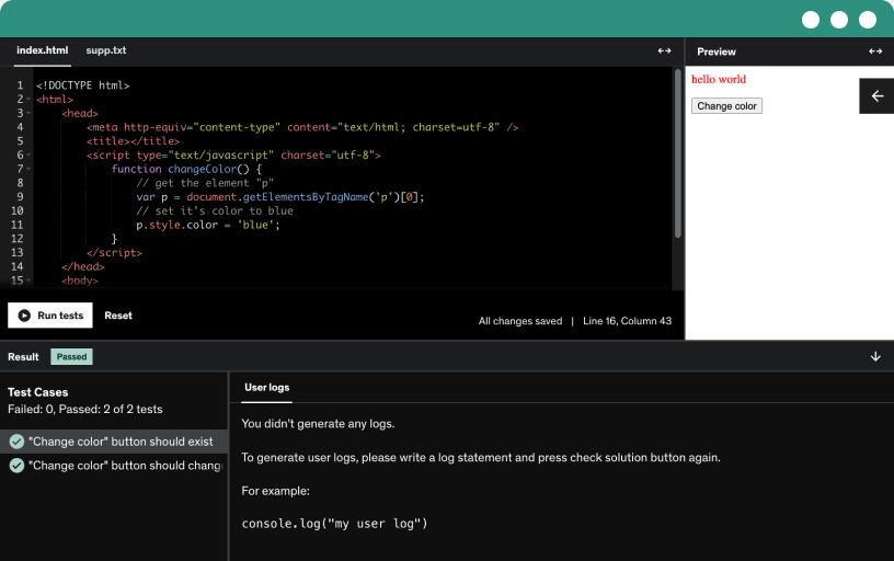
This course includes our updated coding exercises so you can practice your skills as you learn.
See a demo
Learn the end-to-end design process from client brief to high-fidelity web and mobile products, using sketching, wireframes, prototyping, design systems, and Figma.
Join the online classroom to boost accountability, finish the course with support from accountability buddies, community chats, and virtual hangouts that keep you motivated.
Meet the client, define a product to take on Amazon by improving the shopping experience, and showcase a portfolio with a cross-platform design system for web and mobile.
Choose one of two paths: follow along from sketching to final designs, including interactions and animations. Apply the steps to your own client project, building a design system and portfolio.
Create your first custom logo quickly with online logo makers to spark your product idea, then explore the resources page for inspiration.
Explore the designer vs developer roles across planning, design, development, launch, and post-launch iteration, focusing on aesthetics, user experience, and turning designs into functional products.
Explore four key elements of design for web and mobile: graphic design, UX/UI, conversion, and platform development. Build client management skills and basic HTML/CSS to support practical work.
Explore free ZTM resources like coding challenges, open source projects, discourse forums, campus events, cheat sheets, blogs, monthly industry newsletters, career paths, LinkedIn groups, and a YouTube channel.
Learn the sketching process for user experience design, moving from rapid idea generation to refinement, then to wireframes and UI components.
Master the sketching process by preparing tools, defining goals and audience, time-boxing, drawing frames, and detailing interactions with simple shapes, annotations, and team feedback in Figma for UX flows.
Sketch user flows and map the overall journey from onboarding to delivery using digital tools like concepts and figma, exploring pain points and alternative paths.
Sketching screen flows guides users from the home page through search, results, and product detail to add-to-cart and checkout. Explore alternate flows and page hierarchy for a personalized shopping experience.
Sketch navigation schemes to define the product structure, mapping home, saved, cart, checkout, and order screens, and build a minimum viable product site map and navigation tree.
Sketch screen states to map interactions on the home screen, search overlay, and saved items, highlighting micro interactions, cards, carousels, and filters.
Sketch quickly and lean, embracing messy sketches to explore layouts and content. Share progress, iterate with teammates and developers, and prototype frames in Figma to validate interactions.
Stay inspired as a designer by actively engaging with peers, studying others’ solutions, and surrounding yourself with great design while learning across disciplines and embracing mindful walks.
Explore how to find online design inspiration across Dribbble, Pinterest, Behance, and patterns, and learn to curate collections, study UI patterns, and apply subtle animations to mobile navigation.
Explore Figma to design, prototype, and collaborate using components and design systems. Create your free account at figma.com to build, share, and handoff designs for engineering.
Explore where to use Figma, from desktop apps on Mac or Windows to browser-based work, and learn how to start a new design file for flexible, cross-device design.
Learn to navigate Figma in the browser, manage accounts, switch to dark theme, search files, organize drafts and projects, and use favorites, teams, and notifications for collaborative design.
Create and import design files, duplicate and rename them, organize favorites, and navigate the canvas, sidebars, and toolbar in Figma UI files.
Explore the figma toolbar, from the main menu and file controls to view, object, text, and vector options, plus plugins, libraries, and shortcuts for efficient design.
Explore the figma left sidebar, mastering layers, frames, groups, and components. Learn to rename, lock, hide, and reuse assets from the assets panel and libraries across pages.
Master the right sidebar in Figma UI, covering alignment, distribution, sizing, rotation, clipping, layer styles, typography, and export options. Prototype with device previews and multiple flows to visualize interactions.
Distinguish groups, frames, and sections in Figma to organize UI elements, use frames for device scaffolding with auto layout and constraints, and prep handoffs for collaboration.
Explore basic shapes and boolean operations in Figma, mastering rectangles, lines, arrows, ellipses, polygons, stars, and the pen tool to create vector shapes with union, subtract, intersect, and exclude.
Use images in Figma by using the Unsplash plugin, dragging or dropping files, and exporting; edit with crop, scale, rotate, borders, and adjustments like exposure, contrast, saturation, and blend modes.
Learn to design text in Figma by creating frames and text layers, adjusting fonts, size, line height, letter spacing, alignment and lists, and truncation with ellipses.
Learn how constraints in Figma govern layer resizing within frames using horizontal, vertical, top, and bottom rules.
Explore auto layout in Figma using nested frames, fill and hug settings, and padding to create responsive cards. Learn to use auto spacing and truncate text to adapt content.
Explore community files in the explore community section to access design systems, plugins, and icon kits, then open in Figma to add files to drafts for a quick kickstart.
Explore the Figma community and plugins to streamline your workflow, using Unsplash, bookmarking, and opening plugins in new files to quickly add icons and avatars.
Learn to share frames in figma, manage view or edit permissions, watch collaborators' cursors, and use comments with mentions and threaded replies to flows for product managers and engineers.
Learn to build responsive layouts with auto layout, create a logo from shapes, and craft primary, secondary, and text buttons plus a responsive navigation using the Figma basics resource.
Create a quick logo in Figma basics using a shape layer arc, tilt the start, adjust the ratio, and pick color with the eyedropper, duplicating the file if needed.
Create auto layout buttons by framing content, applying fills and strokes, with 44px height, 24px padding, and 6px radius. Build primary, secondary, and text buttons, and add a material icons arrow.
Create a responsive navigation in Figma by assembling a logo, nav items and a button in an autolayout frame, then adjust padding and horizontal gaps for responsiveness.
Create a desktop frame with a black background and navigation, add a 64 px semibold centered tagline, and enable responsive text with auto layout and fill.
Learn to apply imagery and gradients to a frame by adding a background image from Unsplash, layering fills, and building a linear gradient for depth.
Create responsive web layouts by building and nesting frames, using auto layout, and setting max width and padding to keep navigation, text, and buttons centered and flexible.
Create a responsive landing page in Figma using Autolayout, design a logo, buttons, and navigation, and share your work in the course's private Discord.
Define and communicate user flows as a concise sequence of steps that guide a user from welcome screen to a goal, using names, steps, and descriptions.
Craft clear user flows with descriptive names and distinct paths, avoid vague names and sprawling flows, keep flows one-direction, and include only the details users need to complete tasks.
Learn to design three user flows using ready assets, containers, text blocks, buttons, and form elements, and quickly connect them with the Auto Flow plugin.
Learn to speed up your workflow by building reusable wireframe assets for user flows, including images, text blocks, inputs, and primary/secondary buttons, organized in auto layout frames and simple grids.
Design the onboarding flow in Figma with frames and assets for registration. Include welcome screen, optional skip, and steps for email, password, and personalization.
Design a user flow for finding the right product through search, from the home screen to a keyboard prompt, suggestions, search results, and the product page with add to cart.
Explore how site maps provide a hierarchical, bird's-eye view of a product, prioritizing pages and planning navigation schemes. Use them early in design after discovery to inform wireframes.
Explore the anatomy of a sitemap and learn how to label pages. Compare flat and deep sitemaps and plan navigation from home to primary and secondary pages.
Learn to design reusable sitemap assets in Figma using components and non-component versions, and build your own sitemap with the auto flow plugin to connect layers efficiently.
Develop reusable sitemap assets using components and auto layout frames, with color-coded public, member-only, and outside links, and learn to build scalable page containers.
Convert scattered assets into reusable components in Figma by creating master components and instances, then group them as variants with properties like link type and state, boosting consistency and efficiency.
Explore building the top layer of a site map in figma, starting with the home screen, login and sign-up flows, onboarding, and early navigation to categories, deals, and member-only links.
Build shopping interest screens in figma, define categories and deals, add a login paywall and member-only links, and plan trend-based, event-driven content for personalized shopping.
Explore deeper sitemaps in Figma to plan content strategy, prioritize pages like cart, profile, orders, and wish lists, and link layouts for a cohesive e-commerce experience.
Focus on one task at a time when building sitemaps, then use user flows to guide structure, refine in Figma, and apply color to highlight screens.
Use wireframes as low-fidelity blueprints of page structure and UI direction, guided by user flows and site maps, to test concepts and iterate quickly.
Create simple, low-fidelity wireframes using pencil and paper, in grayscale, to clarify layout while validating user goals, business goals, site maps, user flows, and riskiest features.
Learn to build wireframes, create an asset library, and apply color and typography. Generate home, wishlist, and product pages from user flows and sitemaps using lorem ipsum.
Learn to create a reusable basic button component in Figma by building a labeled frame, styling with fill and radius, and turning it into a master component.
Create button variants in Figma by duplicating a base component, detaching instances, and building a component set with size and type properties for easy swapping in the assets panel.
Explore the wireframe assets panel to manage typography, color styles, icons, inputs, and content blocks, and learn to use components, variants, and component properties for flexible wireframes.
Create a cart wireframe that enables quick checkout by displaying product cards, a clear cart total, address details, and a prominent checkout button, with suggested similar items.
Explore rapid, iterative wireframing to design a personalized profile screen in Figma, including a header, editable profile image, interests, and an account details section with orders and wish lists.
Learn the basics of prototyping in Figma by building interactive prototypes from wireframes, including home and wishlist pages, with overlays, full flows, and prototype settings.
Explore the Figma prototyping feature to build interactive user flows with animations, preview your interactions, and share prototypes via links for quick feedback from stakeholders and users.
Master prototyping in Figma by creating multiple flows with starting points and frame connections in the prototype tab. Rename flows, add descriptions, and move starting points for clear navigation.
Learn how to prototype in Figma by creating connections between frames using hotspots, arrows, and destinations, including scroll to actions and overlays for realistic user flows.
Explore how to create and manage interactions in Figma, including triggers like hover or drag, actions like navigate or open overlays, and using multiple interactions from a single layer.
Master prototyping in Figma by applying animation settings to create smooth transitions, using smart animate with move in/out, direction, easing, and duration, and learn why layer naming matters.
Explore prototype settings in Figma, adjust device, frame, and orientation, preview flows, and customize overflow scrolling and background colors to ensure your prototype fits the chosen device.
Learn to present your prototype in Figma using the presentation view, share the design editor, preview on devices, run usability tests, and test interactions.
Create a simple Figma prototype focused on navigation by connecting toolbar items, using dissolve transitions at 300 ms, and previewing bottom toolbar navigation.
Learn to remove a wishlist item with a smart animate transition, a toast confirmation overlay, and undo support to restore the item while content shifts smoothly.
Explore a multi-step product search flow in a Figma prototype, from typeahead results and overlays to selecting a product and adding it to the cart.
Confront imposter syndrome by reframing it as a sign you're learning. Practice teaching others and helping peers in Discord to solidify skills and build confidence.
Use constructive feedback to drive better design, distance yourself from your work, and turn critiques into collaboration that reveals new perspectives and advances your UI/UX process.
Learn to deliver constructive feedback by clarifying meeting context and goals, inviting the right people, and using whiteboard, stickies, time box, and voting to move forward with prioritized feedback.
Define a constructive design critique process to gain insights, move designs forward with constructive feedback, and connect with the right people on the Discord community for ongoing support.
Learn how the grid serves as a layout skeleton, tracing its evolution from handwriting and manuscript layouts to print, Renaissance geometry, the golden ratio, and Swiss design’s white space.
Define an eight-pixel base unit to keep sizing and spacing consistent, then explore responsive grid systems—manuscript, column, modular, and baseline—plus typography on a baseline grid in figma.
Explore grids and spacing, including fluid and fixed grids, learn about breakpoints and design rules, and build and style your own grid for responsive layouts.
Explore fixed and fluid grids in Figma. Keep a constant container width in fixed grids while margins adjust; fluid grids resize with content using percentages, preserving gutters and margins.
Master breakpoints and responsive grids for web and mobile design. Learn to set four breakpoints, adapt content with fluid layouts, and adjust margins and stacking for various screen sizes.
Learn to create and reuse grid styles in Figma, apply and edit them across frames, and publish styles for cross-file reuse while noting that free accounts restrict component publishing.
Learn to build a mobile layout grid by creating an eight-column grid with an eight-pixel baseline, making it responsive and adaptable to different screen sizes.
Design a desktop grid by copying an existing large grid, creating a 12-column layout with 32-pixel gutters and a 56-pixel margin for breathing space, and maintain responsiveness.
apply a consistent grid by placing elements on columns, align content within cards, use gutters and breakpoints for breathing room, and design full-bleed elements beyond the grid.
Discover serif typefaces and their four subtypes—old style, transitional, modern, and slab serif—through traditional, elegant contrasts with examples like Jenson, Center, Goudy, Times New Roman, Baskerville, Didot, Archer, and Courier.
Explore sans serif classifications—grotesque, neo grotesque, humanist, and geometric—and their distinct letter forms and contrasts, with examples like Helvetica, Futura, and Proxima Nova. Apply these insights in Figma next.
Explore display typefaces like lobster and Abril, and mono space fonts such as Roboto Mono; use display for headlines and mono space for code readability in programming.
Choose typefaces by mood and how they reinforce brand voice. See formal, traditional, modern, and display contrasts and test fonts like Helvetica in Figma for fintech, bakery, and furniture brands.
Explore typography to strengthen brand identity and learn mood-driven choices for consultancy versus basic UI. Develop understanding of text properties and start building a personal typographic system for your designs.
Explore typography in Figma by mastering text properties, including font family and weight, size, spacing, alignment, resizing behavior, and advanced options like lists, case, and variable fonts.
Explore how typography and color contrast elevate a brand in Figma by mixing fonts, weights, and text properties to build trust.
Explore how typeface choices shape brand voice and user perception in UI design, using Merriweather and Source Sans Pro for readability, contrast, and clear error messaging that conveys seriousness.
Explore Google fonts in Figma, search font families, test typography with the type tester, and pair serif with sans serif to elevate your brand.
Evaluate font families for brand personality, compare serif and sans options, and pair Inter with Laura to create versatile headings and body copy for web and mobile design.
Create a typographic system using Laura and Inter, with headings 32 to 14 px at 125% line height, body 16 px at 150% line height, and ui element labels.
Explore a practical typography system for web and mobile design, detailing heading, body, and label styles, font weights, line heights, and reusable naming conventions for fast, plug‑and‑play UI typography.
Learn to create and manage text styles in Figma, including headings and body variants, edit properties, publish styles, and use the Style Manager to export and import styles across files.
Just updated with all modern Design tools and best practices! Join a live online community of over 900,000+ students and a course taught by industry experts that have actually worked both in Silicon Valley and Toronto for top companies. A great Designer is becoming harder and harder to find and it isn't rare to find designers make $160,000+ salaries now because it is such a valuable skill. We will teach you how to get there!
Using the latest best practices in Web Design and Mobile Design as well as User Interface and User Experience Design (UI/UX), this course focuses on efficiently getting you from zero to a point where you can get hired or win freelance contracts. We will use in demand tools like Figma to show you a full workflow from start to finish. Graduates of Andrei’s courses are now working at Google, Tesla, Amazon, Apple, IBM, JP Morgan, Facebook, + other top tech companies.
The course also includes 100+ assets and premium design templates that you can keep and use to customize for all your future projects. We guarantee you this is the most comprehensive online resource on Design skills!
The curriculum is going to be very hands on as we walk you from start to finish of working as a Designer, all the way into learning how to create final professional designs and then converting them into actual websites or apps using HTML and CSS.
The topics covered in the course are...
00 Web & Mobile Design Principles + Design vs Web Development
01 GETTING STARTED – Sketching, Inspiration + Structure
1. Sketching
Introduction To Sketching
The Sketching Process
Sketching User Flows
Sketching Tips
2. Inspiration
How to stay inspired
How to find inspiration online
3. Figma Basics
Plans and Signup
Where to Use Figma
Figma UI — Structure
Figma UI — Files
Figma UI — Toolbar
Figma UI — Left Sidebar
Figma UI — Right Sidebar
Shapes and Tools — Frames
Shapes and Tools — Groups
Shapes and Tools — Basic Shapes and Boolean Operations
Designing in Figma — Images
Designing in Figma — Getting Started with Text
Designing in Figma — Constraints
Designing in Figma — Using Auto Layout
Designing in Figma — Auto Layout Properties
Resources and Collaboration — Community Files
Resources and Collaboration — Community Plugins
Resources and Collaboration — Sharing and Comments]
Project — Creating a Logo Using Basic Shapes
Project — Auto Layout Buttons
Project — Creating a Responsive Navigation
Project — Responsive Text
Project — Imagery and Gradients
Project — Strokes and Shapes
Project — Layout and Responsiveness
3. User Flows
Getting Ready For This Section
The DOs and DON'Ts
User Flows in Figma — Onboarding
User Flows in Figma — Search
4. Sitemaps
Introduction To Sitemaps
Creating A Basic Sitemap
Reusable Sitemap Assets
Figma Check In — Basic Components and Variants
Sitemaps in Figma — The Top Layer
Sitemaps in Figma — Digging Deeper
Tips for Creating Great Sitemaps
02 EXPLORE AND ITERATE – Wireframes, Prototyping and Feedback
1. Wireframes
What Is A Wireframe?
How To Create A Wireframe
Figma Check In — Basic Button Component]
Figma Check In — Variants
How to Use Our Wireframe Components
Wireframes — Home
Wireframes — Cart
Wireframes — Profile
2. Prototyping
Figma Check In — Prototyping in Figma
Prototyping in Figma — Flows and Starting Points
Prototyping in Figma — Connections
Prototyping in Figma — Interactions
Prototyping in Figma — Animations
Prototyping in Figma — Prototype Settings
Prototyping in Figma — Prototype Presentation
Project — Navigation
Project — Removing an Item from Your Wishlist
Project — Finding a Product
3. Getting feedback
Why Is Feedback Important?
Constructive Feedback
03 VISUAL DESIGN – Design Theory + Accessibility
1. Spacing and Grids
What Is A Grid?
Grid Basics
Figma Check In — Fixed and Fluid Grids
Figma Check In — Breakpoints
Figma Check In — Grid Style
Project — Mobile Layout Grid
Project — Desktop Layout Grids
Simple Rules to Follow
2. Typography
Serifs
Sans Serifs
Display & Mono
Picking Typefaces
Figma Check In — Text Properties
Exercise — Elevating a Brand
Exercise — Typeface Scenarios
Exercise — Google Fonts
Project — Typeface Exploration
Project — Pairing Font Families
Project — Headings, Body and Labels
Project — Typeface System
Figma Check In — Text Styles
3. Color
Color Schemes
Important Questions To Ask
Creating Color Palettes
Figma Check In — Paints
Exercise — Expanding Upon a Strict Color Palette
Exercise — Creating a Color Palette
Figma Check In — Color Styles
Exercise — Using Color Styles
Project — Primary and Neutrals
Project — Accents
4. Imagery and Iconography
Visual Assets Introduction
Figma Check In — Image Plugins
Figma Check In — Image Styles
Figma Check In — Masks
Exercise — Image Exploration
Exercise — Text and Imagery Working Together
Figma Check In — Illustration Plugins
Exercise — Adding illustrations to your designs
Figma Check In — Icon Plugins
Figma Check In — Pen Tool
Exercise — Custom Icons with the Pen Tool
5. Forms + UI Elements
What Are Forms + UI Elements?
Best Practices — Forms
Best Practices — Basic and Advanced Inputs
Best Practices — Inputs
Best Practices — Buttons
Figma Check In — Component Properties
Properties vs. Variants
Figma Check In — Button Component Properties
Figma Check In — Button Variants
Figma Check In — Combining Components
Figma Check In — Form Component Possibilities
Project — Registration Flow
6. Accessibility
What Is Accessibility?
Assistive Technologies
Visual Patterns For Accessibility
Tools To Make Your Design Accessible
04 DESIGN EXPLORATION – Application Design + Design Systems
1. Design Patterns
What Are Design Patterns?
Why Are Design Patterns Valuable?
How To Apply Design Patterns
Analyzing Design Patterns
Dissecting And Choosing Design Patterns
2. Mobile Design
Mobile Design Best Practices
3. Visual Style and Exploration
Design Fidelity
Visual Exploration — Navigation
Visual Exploration — Buttons
Figma Check In — Effect Styles
Visual Exploration — Product Cards
Visual Exploration — Text Cards
Screen Design — Home
Screen Design — Product Page
4. Motion and Microinteractions
The Importance Of Motion
Why Microinteractions Are Important?
What Is A Microinteraction?
Figma Check In — Intro to Smart Animate
Figma Check In — Smart Animate Properties
Exercise — Parallax
Exercise — New Message
Exercise — Overlays
Figma Check In — Interactive Components
Exercise — Interactive Buttons
Project — Parallax Welcome Screen
Project — Drag Onboarding
Project — Cart Overlay
Project — Button Microinteraction
05 PUTTING IT ALL TOGETHER – Using our Design System and Hi-Fi prototyping with Figma
1. Design Systems
Foundational Styles and Components vs. Product Specific Components
Building Fidelity and Organizing Potential Components and Styles
Foundational Styles and Components
Components — Buttons
Components — Cards
Components — Headers
Components — Inputs
Components — List Items
Components — Navigation
Components — Misc. Elements
2. Execution
Working Towards Our Final Designs
Execution — Introduction Screen
Execution — Onboarding Screens
Execution — Registration Screens
Execution — Home Screen
Execution — Wishlist Screens
Execution — Profile Screen
Execution — Cart and Checkout
Prototypes — Registration
Prototypes — Adding to Cart
Prototypes — Checkout
Prototypes — Lottie Files Plugin
Prototypes — Search and Filters
06 FROM FIGMA TO WEBSITE (take a Figma design and convert it to a live website using HTML and CSS)
07 HTML + HTML5
08 CSS + CSS3 - CSS Basics, CSS Grid, Flexbox, CSS Animations
09 PUTTING YOUR WEBSITE ONLINE
This brand new course will take you from the very basics where we talk about principles and fundamentals of graphic design, all the way to creating beautiful products, learning about UX/UI and interactions, and creating a full design process for you to use with all of your future projects and clients. We pretty much cover it all so that the next time you are in charge of designing a product you have the step by step outline and guide to work as a professional designer.
We are going to teach you the skills that will allow you to charge a lot of money for your time. Not to compete for a few dollars an hour on some random freelancing websites. The goal is to give you the skills of a top designer, and along the way, we are going to design an actual product for a company that you will be able to add to your portfolio.
This course is not about making you just watch along without understanding the principles so that when you are done with the course you don’t know what to do other than watch another tutorial. No! This course will push you and challenge you to go from an absolute beginner to someone that is a top Designer that can get hired! Design is a valuable skill that doesn’t get outdated easily like most technical skills. Trends change, but the skills and fundamentals you learn in this course will take you many years into the future.
This course is for you if:
- You are a complete beginner looking to become a designer and freelance
- You are a designer who is looking to charge more for your work
- You are a developer who is looking to improve their design skills
Taught By:
Andrei is the instructor of the highest rated Development courses on Udemy as well as one of the fastest growing. His graduates have moved on to work for some of the biggest tech companies around the world like Apple, Google, Tesla, Amazon, JP Morgan, IBM, UNIQLO etc... He has been working as a senior software developer in Silicon Valley and Toronto for many years, and is now taking all that he has learned, to teach programming skills and to help you discover the amazing career opportunities that being a developer allows in life.
Having been a self taught programmer, he understands that there is an overwhelming number of online courses, tutorials and books that are overly verbose and inadequate at teaching proper skills. Most people feel paralyzed and don't know where to start when learning a complex subject matter, or even worse, most people don't have $20,000 to spend on a coding bootcamp. Programming skills should be affordable and open to all. An education material should teach real life skills that are current and they should not waste a student's valuable time. Having learned important lessons from working for Fortune 500 companies, tech startups, to even founding his own business, he is now dedicating 100% of his time to teaching others valuable software development skills in order to take control of their life and work in an exciting industry with infinite possibilities.
Andrei promises you that there are no other courses out there as comprehensive and as well explained. He believes that in order to learn anything of value, you need to start with the foundation and develop the roots of the tree. Only from there will you be able to learn concepts and specific skills(leaves) that connect to the foundation. Learning becomes exponential when structured in this way.
Taking his experience in educational psychology and coding, Andrei's courses will take you on an understanding of complex subjects that you never thought would be possible.
Daniel is a design leader in tech with extensive experience in helping startups build and iterate on their products. Daniel is passionate about teaching and empowering designers and working with other disciplines to build purposeful products that meet both user and business goals.
His approach to design is always thoughtful and iterative. Daniel often finds himself working collaboratively with his team whether that is sketching concepts and flows or leading design strategy with team leads and external stakeholders.
Daniel is a multi faceted designer who’s expertise expands across multiple design disciplines. This includes User Experience and Visual Design, User Research, Product Strategy, Lean and Agile Design Methodologies and much more. HIs work has helped to shape different solutions for a variety of industries such as housing, blockchain and health.
When he is not building products, Daniel has spoke and mentored at different meetups and events. He aims to give back to the design community that he has learnt and continues to learn so much from. Daniel aims to always help, teach and support other designers in their careers.
See you inside the courses!