Your cart is empty.
Keep shopping

Teach on Udemy
Turn what you know into an opportunity and reach millions around the world.
Learn MoreBecome a Data Analyst: Excel, SQL & Tableau - 3-in-1 Bundle
Become a Data Analyst: Excel, SQL & Tableau - 3-in-1 Bundle
Boost Your Career with Data Analytics: Learn Excel, SQL & Tableau for Advanced Business Insights & Competitive Advantage
Created byStart-Tech Academy, Abhishek Bansal, Pukhraj Parikh
Last updated 9/2026
English
EnglishFrench [Auto],
What you'll learn
- Discover the power of Excel and use it to manipulate and analyze data like a pro.
- Master SQL queries to extract, filter, and aggregate data from relational databases.
- Explore Tableau's interface and create stunning visualizations that communicate insights.
- Develop the skills to integrate data from multiple sources and create interactive dashboards in Tableau.
- Apply best practices for data cleaning, wrangling, and transformation in Excel and SQL
- Create dynamic and automated reports in Tableau that update with new data.
- Use Excel and Tableau to identify trends, patterns, and outliers in data.
- Develop a data-driven mindset and use data to make informed business decisions.
- Apply critical thinking and problem-solving skills to data analysis challenges.
Coding Exercises
This course includes our updated coding exercises so you can practice your skills as you learn.
See a demo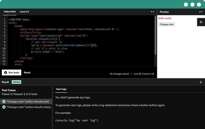
Course content
58 sections • 277 lectures • 28h 47m total length
- Introduction4:26
In Lecture 1 of the Section 1: Introduction of the course "Become a Data Analyst: Excel, SQL & Tableau - 3-in-1 Bundle", we will cover the basics of what it means to be a data analyst and the importance of utilizing Excel, SQL, and Tableau in this profession. We will discuss the various skills and tools needed to excel in the field of data analysis and how these three software programs play a crucial role in analyzing and interpreting data effectively.
Additionally, we will explore the different types of data analysis that can be conducted using Excel, SQL, and Tableau, and how each program is uniquely suited for specific tasks. By the end of this lecture, students will have a better understanding of how data analysis is used in various industries and how mastering these tools can enhance their data analysis skills and career opportunities. - Course resources0:04
- Getting started with Excel8:18
In this lecture, we will begin our journey into the world of Excel by covering the basics. We will start by exploring the Excel interface and familiarizing ourselves with the different components such as the ribbon, cells, rows, and columns. We will also learn how to navigate through a worksheet, enter data, and format it to make it more visually appealing and easier to read. Additionally, we will discuss common Excel terminology and basic functions that are essential for data analysis.
Furthermore, we will dive into practical exercises where we will create our first Excel spreadsheet from scratch. We will learn how to input data, manipulate it using basic formulas, and customize the appearance of our spreadsheet. By the end of this lecture, you will have a solid understanding of the fundamental features of Excel and be ready to tackle more complex data analysis tasks in the future. - This is a Milestone!3:52
- Worksheet basics16:41
In Lecture 5 of Section 2: Excel Basics, we will be covering the basics of creating and navigating worksheets in Microsoft Excel. We will discuss how to insert, delete, and move cells within a worksheet, as well as how to rename and format worksheets to better organize your data. Additionally, we will explore how to freeze and split panes within a worksheet to keep certain rows or columns visible while scrolling through large datasets.
Furthermore, we will delve into how to use basic formulas and functions in Excel to perform calculations on your data. We will cover essential functions such as SUM, AVERAGE, MAX, and MIN, as well as demonstrate how to use cell references and relative versus absolute cell addressing in formulas. By the end of this lecture, you will have a solid understanding of Excel's worksheet functionality and be able to efficiently organize and analyze your data using formulas and functions. - Entering values and Formulas7:04
In Lecture 6 of Section 2: Excel Basics, we will be covering the essential skills of entering values and formulas in Microsoft Excel. Understanding how to input data accurately is key to becoming a proficient data analyst. We will go over the different ways to enter values, such as typing directly into a cell, using the formula bar, or pasting data from another source.
Additionally, we will delve into the world of formulas in Excel. Formulas are powerful tools that allow you to perform calculations on your data quickly and efficiently. We will cover basic arithmetic operations, as well as more advanced functions like SUM, AVERAGE, and IF. By the end of this lecture, you will have a solid foundation in entering values and using formulas in Excel, setting you up for success in your data analysis journey. - Data Formats8:36
In this lecture, we will be covering the various data formats that can be utilized within Excel. Understanding data formats is crucial in order to effectively analyze and manipulate data within spreadsheets. We will discuss the different types of data formats such as text, numbers, dates, and times, and how to format each type appropriately to ensure accurate calculations and visualizations.
Additionally, we will explore the importance of converting data formats when necessary, as well as how to apply formatting options such as currency, percentages, and decimals. By the end of this lecture, you will have a comprehensive understanding of how to work with data formats in Excel, allowing you to optimize your data analysis and visualization skills for future projects. - Data Handling Basics - Cut, Copy, Paste13:56
In this lecture, we will be covering the basics of data handling in Excel. We will focus on essential functions such as cut, copy, and paste, which are fundamental skills for any data analyst. By mastering these techniques, you will be able to efficiently manipulate large data sets, organize information, and create visualizations that can aid in decision-making processes.
We will start by discussing how to select and highlight data in Excel, as well as the different methods for cutting, copying, and pasting information. We will also explore the various options for pasting data, including pasting values, formulas, and formatting. Additionally, we will cover shortcuts and tips for speeding up your workflow and improving your overall efficiency when handling data in Excel. By the end of this lecture, you will have a solid understanding of basic data handling techniques that will be essential for your success as a data analyst. - Saving and Printing in Excel8:56
In Lecture 9 of Section 2: Excel Basics, we will be covering the important topics of saving and printing in Excel. Saving your work regularly is crucial to ensure that you do not lose any important data or changes you have made to your spreadsheet. We will go over the various ways you can save your Excel file, including saving to your computer, saving to a cloud storage service, and saving in different file formats such as .xlsx or .csv.
Additionally, we will discuss how to print your Excel spreadsheet in Lecture 9. Printing your spreadsheet can be useful for sharing with others, presenting data in a physical format, or creating hard copies for your records. We will demonstrate how to adjust page orientation, margins, headers and footers, and printing options to ensure your spreadsheet looks professional and is easy to read when printed. Be sure to follow along with the lecture to learn the best practices for saving and printing in Excel. - Quiz
- Basic Formula Operations13:07
In Lecture 10 of Section 3: Essential Excel functions, we will be covering basic formula operations in Excel. We will explore how to use simple arithmetic operations such as addition, subtraction, multiplication, and division within Excel formulas. We will also delve into how to refer to specific cells and ranges in formulas, as well as understanding the order of operations in Excel formulas.
Furthermore, we will discuss the use of absolute and relative cell references in Excel formulas. Understanding the difference between these types of cell references is crucial for creating dynamic and flexible formulas in Excel. We will also cover how to use functions such as SUM, AVERAGE, MAX, and MIN in Excel to quickly perform calculations on data within your spreadsheets. By mastering these basic formula operations, you will be well-equipped to handle more complex data analysis tasks in Excel. - Mathematical Functions - Part 111:35
In Lecture 11 of Section 3: Essential Excel functions, we will be focusing on mathematical functions. This lecture will cover a variety of mathematical functions available in Excel, such as SUM, AVERAGE, MAX, MIN, and COUNT. We will learn how to use these functions to perform calculations and analyze data in Excel spreadsheets.
Throughout this lecture, we will explore the different ways in which these mathematical functions can be applied in a data analysis context. By the end of the lecture, students will have a solid understanding of how to use these functions effectively to manipulate and analyze numerical data in Excel. This foundational knowledge will be essential for building more complex data analysis skills in future lectures of the course. - Mathematical Functions - Part 27:31
In this lecture, we will continue our exploration of essential Excel functions, focusing specifically on mathematical functions. We will delve into more advanced mathematical functions such as SUMPRODUCT, ROUND, and MOD, and learn how to use them effectively in data analysis. By understanding how to apply these functions, you will be able to perform complex calculations and manipulate data with ease.
Additionally, we will discuss how to use Excel's mathematical functions in combination with other functions to create powerful formulas that can automate tasks and streamline your data analysis process. Through hands-on examples and practical exercises, you will develop a deeper understanding of how mathematical functions can be utilized to extract valuable insights from your datasets. By the end of this lecture, you will be well-equipped to handle a wide range of mathematical calculations in Excel and enhance your data analysis skills. - Quiz
- Difference between RANK, RANK.AVG and RANK.EQ0:36
In Lecture 13 of Section 3 of the course "Become a Data Analyst: Excel, SQL & Tableau - 3-in-1 Bundle," we will be covering the essential Excel functions RANK, RANK.AVG, and RANK.EQ. These functions are used to rank values in a list or data set based on specific criteria. We will discuss how each function works and when to use them in practical data analysis scenarios.
We will explore the key differences between RANK, RANK.AVG, and RANK.EQ, including how they handle ties and calculate ranking values. Understanding these nuances is crucial for accurately ranking data in Excel and ensuring that your analysis is reliable and reproducible. By the end of this lecture, you will have a solid grasp of how to use these functions effectively in your data analysis projects. - Exercise 1: Mathematical Functions0:12
In Lecture 14 of Section 3, we will be covering Exercise 1 focused on Mathematical Functions in Excel. We will delve into essential Excel functions that will help you manipulate numbers and perform calculations efficiently. We will discuss functions such as SUM, AVERAGE, MAX, and MIN, and how to effectively use them in Excel to analyze and interpret data.
Additionally, we will demonstrate how to use Excel to perform basic mathematical operations such as addition, subtraction, multiplication, and division. By the end of this lecture, you will have a solid understanding of how to use mathematical functions in Excel to organize and analyze data, which will be a valuable skill as you continue your journey to becoming a proficient data analyst. - Textual Functions - Part 18:45
In Lecture 15 of Section 3 on Essential Excel functions, we will be exploring Textual Functions in Excel. Textual functions are essential tools for data analysts as they allow for manipulation of text within Excel. We will cover functions such as CONCATENATE, LEFT, RIGHT, MID, LEN, and FIND, which are crucial for tasks like combining text, extracting specific characters from a string, and finding the length of a text string.
Additionally, we will delve into the usage of text functions in practical scenarios, demonstrating how they can be applied to clean and preprocess data effectively. By the end of this lecture, you will have a solid understanding of how to utilize Textual Functions in Excel to enhance your data analysis skills and streamline your workflow. Be prepared to engage with hands-on exercises and examples to solidify your knowledge and gain confidence in using these functions effectively. - Textual Functions - Part 28:37
In this lecture, we will continue our exploration of essential Excel functions with a focus on textual functions. We will dive into advanced features such as CONCATENATE, LEFT, RIGHT, MID, FIND, and LEN, which allow you to manipulate and extract text data efficiently. These functions are incredibly useful for cleaning and organizing your data, making your analysis process much smoother and more streamlined.
Additionally, we will discuss how to use the SUBSTITUTE function to replace specific text within a cell and the UPPER, LOWER, and PROPER functions for changing the case of text. By mastering these textual functions, you will be able to handle a wide range of text-related tasks in Excel, enhancing your data analysis skills and increasing your overall productivity. Make sure to follow along with the examples and practice exercises to solidify your understanding of these essential Excel functions. - Exercise 2: Textual Functions0:07
In Lecture 17 of Section 3, we will be focusing on Exercise 2 which covers Textual Functions in Excel. These functions are essential for cleaning and analyzing textual data within spreadsheets. We will learn how to use functions such as LEFT, RIGHT, MID, CONCATENATE, FIND, and SUBSTITUTE to manipulate text within cells, extract specific parts of text, combine text from different cells, find specific characters or words within text, and replace text with other text.
By the end of this lecture, students will have a thorough understanding of how to use Textual Functions to improve data analysis and visualization in Excel. This knowledge will be valuable for anyone looking to become a proficient data analyst, as the ability to manipulate textual data efficiently is a fundamental aspect of working with spreadsheets. Make sure to practice the exercises provided in this lecture to master these essential Excel functions and enhance your data analysis skills. - Quiz
- Logical Functions11:13
In Lecture 18 of Section 3: Essential Excel functions, we will be diving into the world of logical functions. We will explore how to use logical functions such as IF, AND, and OR to make decisions and perform calculations based on certain conditions. By the end of this lecture, you will understand how to use these functions to streamline your data analysis process and make more informed decisions.
Furthermore, we will learn how to combine logical functions with other Excel functions to create more advanced formulas. We will cover topics such as nested logical functions and the use of logical functions in combination with SUMIF and COUNTIF functions. By the end of this lecture, you will have a strong grasp of how to use logical functions effectively in Excel to analyze data and draw meaningful insights. - Exercise 3: Logical Functions0:13
In Lecture 19 of Section 3 of the "Become a Data Analyst: Excel, SQL & Tableau - 3-in-1 Bundle" course, we will be diving into Exercise 3 focusing on Logical Functions in Excel. We will explore the different types of logical functions such as IF, AND, OR, and NOT, and how they can be used to make decisions and perform tasks based on specific conditions within Excel. We will also learn how to nest logical functions to create more complex formulas that cater to multiple conditions.
Furthermore, our lecture will provide hands-on practice exercises where students will have the opportunity to apply what they have learned about logical functions in Excel. By the end of this lecture, students will have a solid understanding of how to use logical functions effectively in their data analysis tasks, allowing them to manipulate and analyze data with greater efficiency and accuracy. - Date-Time Functions6:59
In this lecture, we will be covering essential Excel functions related to date and time. We will explore how to manipulate and analyze date and time data efficiently using Excel. Topics that will be covered include how to convert text to date, how to calculate the difference between two dates, how to extract specific components of a date such as year, month, and day, and how to format date and time values according to different styles.
Additionally, we will learn about advanced date-time functions such as DATE, TIME, NOW, TODAY, WEEKDAY, and WORKDAY. These functions can be useful in a wide range of scenarios such as calculating the number of working days between two dates, extracting the day of the week from a given date, and determining today's date. By the end of this lecture, you will have a solid understanding of how to leverage Excel's date-time functions to enhance your data analysis skills. - Exercise 4: Date-Time Functions0:09
In this lecture, we will be diving into essential Excel functions related to date and time. We will cover functions such as TODAY, NOW, DATE, TIME, and WEEKDAY, which are commonly used in data analysis to manipulate and extract information from date and time values. We will also explore how to calculate the difference between two dates, find the last day of the month, and extract specific components such as year, month, and day from a date value.
Moreover, we will be practicing these functions in Exercise 4, where we will work on real-life scenarios to apply our knowledge of date-time functions. Through hands-on exercises, you will learn how to perform calculations on date and time values, format them properly, and use them effectively in data analysis tasks. By the end of this lecture, you will have a solid understanding of how to work with date-time functions in Excel, which is essential for any aspiring data analyst. - Lookup Functions ( V Lookup, Hlookup, Index-Match )8:34
In Lecture 22 of Section 3: Essential Excel functions, we will be diving deep into Lookup Functions, specifically VLOOKUP, HLOOKUP, and INDEX-MATCH. These functions are essential for data analysts as they allow us to search for specific information within a large dataset quickly and efficiently. We will learn how to use VLOOKUP to find a value in a vertical table, HLOOKUP to find a value in a horizontal table, and INDEX-MATCH to locate a value based on both the row and column position.
Additionally, we will explore practical examples and case studies to demonstrate how these Lookup Functions can be applied in real-world scenarios. By the end of this lecture, you will gain a solid understanding of how to use VLOOKUP, HLOOKUP, and INDEX-MATCH effectively in Excel to streamline your data analysis processes and make informed decisions based on accurate information. This knowledge will be invaluable as you continue to advance your skills in Excel and progress in your career as a data analyst. - Exercise 5: Lookup Functions0:10
In Lecture 23 of Section 3: Essential Excel functions, we will be focusing on Exercise 5 which covers Lookup Functions. This lecture will teach you how to use functions such as VLOOKUP, HLOOKUP, INDEX and MATCH to efficiently search and retrieve data within a large dataset. You will learn how to use these functions to quickly find and display information based on specific criteria, saving you time and effort in your data analysis tasks.
By the end of this lecture, you will have a solid understanding of how to effectively use Lookup Functions in Excel to streamline your data analysis processes. You will be able to confidently apply these functions in real-world scenarios to extract relevant information and make informed decisions based on your findings. Additionally, this exercise will provide you with practical hands-on experience that will enhance your skills as a data analyst and improve your proficiency in Excel. - Quiz
- Sorting, Filtering and Data Validation13:15
In Lecture 24 of Section 4: Data Tools, we will be covering the important skills of sorting, filtering, and data validation in Excel. Sorting allows you to organize your data in a meaningful way by arranging it in a particular order based on the values in one or more columns. We will explore how to sort data alphabetically, numerically, and by dates. Filtering allows you to narrow down your data set by displaying only the rows that meet specific criteria. We will learn how to apply different filters to our data and how to customize our filters to show only the information we need.
Additionally, we will dive into data validation, which is a powerful tool in Excel that allows you to control what type of data is entered into a cell or range of cells. We will discuss how to use data validation to create drop-down lists, restrict the input of numbers or text, and set minimum and maximum values for cells. By mastering these techniques, you will be able to efficiently manage and manipulate data in Excel, improving your skills as a data analyst. - Text-to-columns and remove duplicates5:40
In Lecture 25 of Section 4: Data Tools, we will be diving into the topic of text-to-columns and removing duplicates in Excel. Text-to-columns is a powerful feature in Excel that allows you to split data in a single column into multiple columns based on a specified delimiter. We will discuss how to use this feature to clean and organize your data for analysis.
Additionally, we will cover how to remove duplicates in Excel to ensure that your data is accurate and free of any redundancies. Removing duplicates is essential when working with large datasets to prevent errors and inaccuracies in your analysis. By the end of this lecture, you will have a solid understanding of how to use text-to-columns and remove duplicates in Excel to enhance your data analysis skills. - Advanced Filter option22:13
In Lecture 26 of Section 4, we will be covering the Advanced Filter option in Excel, which is a powerful tool to help data analysts filter and sort data more efficiently. We will learn how to use the Advanced Filter option to apply complex criteria to filter data sets, including conditions based on multiple columns and logical operators. This tool is essential for data analysts to quickly extract and analyze specific subsets of data, saving time and improving productivity in data management tasks.
Additionally, we will explore how to use the Advanced Filter option in conjunction with SQL queries to further enhance data analysis capabilities. By combining Excel's Advanced Filter with SQL, data analysts can access and filter data from large datasets more effectively, enabling them to identify trends, patterns, and insights in the data that may have previously been overlooked. This lecture will provide practical examples and hands-on exercises to help students master the Advanced Filter option and leverage its full potential in their data analysis projects. - Exercise 6: Data Tools0:12
In Lecture 27 of Section 4: Data Tools, we will be diving into Exercise 6 where we will practice using various data tools to analyze and manipulate data effectively. We will explore how to apply the concepts of Excel, SQL, and Tableau in a real-world scenario to gain valuable insights from datasets.
Throughout this exercise, we will learn how to use Excel functions to clean and organize data, SQL queries to retrieve specific information from databases, and Tableau visualizations to present data in a meaningful way. By the end of this lecture, you will have a better understanding of how to leverage these data tools to make informed business decisions and enhance your data analysis skills. - Quiz
- Formatting data and tables18:00
In Lecture 28 of Section 5: Formatting data and tables, we will delve into the importance of properly formatting data and tables in Excel, SQL, and Tableau. We will discuss how formatting can make your data more visually appealing, organized, and easier to understand for your audience. By the end of this lecture, you will have a thorough understanding of various formatting techniques that are crucial for presenting your data effectively.
During this lecture, we will cover topics such as applying conditional formatting in Excel to highlight specific data points, manipulating data using SQL queries to format tables for analysis, and utilizing formatting options in Tableau to create visually stunning and interactive dashboards. Additionally, we will explore the best practices for formatting data and tables to ensure that your analysis is accurate, consistent, and easily accessible. By mastering the art of formatting, you will be able to present your findings in a clear and concise manner, making it easier for stakeholders to interpret and act upon your data-driven insights. - Exercise 7: Formatting0:10
In this lecture, we will be covering Exercise 7, which focuses on formatting data and tables in Excel. We will learn how to use various formatting tools to make our data more visually appealing and easier to understand. We will explore techniques such as applying conditional formatting, changing fonts and colors, and adjusting column widths and row heights. By the end of this lecture, you will have the skills to format your data in Excel to enhance its readability and effectiveness.
Additionally, we will discuss the importance of formatting data in SQL and Tableau. We will explore how to format query results in SQL using functions such as CONCATENATE and FORMAT. In Tableau, we will cover how to format data visualizations to improve their clarity and impact. By the end of this lecture, you will have a comprehensive understanding of how to format data and tables in Excel, SQL, and Tableau to enhance your data analysis skills.
- Pivot Tables8:25
In this lecture, we will be diving into the world of pivot tables, a powerful tool in Excel that allows you to summarize and analyze large amounts of data quickly and efficiently. We will start by discussing what pivot tables are and how they can help you organize and analyze data in a more meaningful way. We will also cover how to create pivot tables, customize them to meet your specific needs, and use them to draw valuable insights from your data.
Additionally, we will explore some advanced techniques for working with pivot tables, such as grouping and sorting data, calculating subtotals and percentages, and creating interactive dashboards. By the end of this lecture, you will have a solid understanding of how to use pivot tables to transform raw data into actionable insights that can drive informed decision-making in your organization. So, come prepared to roll up your sleeves and dive into the world of pivot tables in Excel. - Exercise 8: Pivot tables0:08
In Lecture 31 of the "Become a Data Analyst: Excel, SQL & Tableau" course, we will be diving into Exercise 8 which focuses on Pivot tables. Pivot tables are an essential tool in Excel that allows you to summarize and analyze large data sets with ease. We will be learning how to create pivot tables, customize them to your specific needs, and use them to gain valuable insights from your data.
During this lecture, we will walk through step-by-step exercises to practice creating pivot tables from scratch, organizing data, applying filters, and formatting the tables for better visual representation. By the end of this lecture, you will have a solid understanding of how to use pivot tables to analyze data effectively and present your findings in a clear and concise manner. This skill is highly sought after in the field of data analysis and will greatly enhance your ability to work with and interpret data sets in Excel. - Quiz
- Excel Charts - Categories of messages that can be conveyed4:34
In this lecture, we will be diving into the various categories of messages that can be effectively conveyed through Excel charts. We will explore how different types of charts can be used to communicate different types of information in a clear and concise manner. From showing trends and patterns to comparing data sets, Excel charts are an essential tool for data analysts to visually represent complex data for easy interpretation.
We will also discuss the importance of choosing the right type of chart for the message you want to convey. Whether you are looking to display data relationships, distributions, proportions, or trends over time, selecting the appropriate chart type is crucial for effectively communicating your insights to stakeholders. By the end of this lecture, you will have a solid understanding of how to use Excel charts to effectively convey various messages and enhance your data analysis skills. - Elements of charts5:23
In this lecture, we will be diving deep into the elements of Excel charts. We will explore the various components of a chart, such as axes, labels, legends, and titles, and learn how to customize each of these elements to effectively communicate data insights. By the end of this session, you will have a comprehensive understanding of how to enhance the visual appeal and clarity of your charts in Excel.
Additionally, we will discuss how to choose the right type of chart for different types of data and analysis. Understanding which chart type is best suited for presenting your data is crucial for effectively conveying your message and making informed decisions. We will provide examples and practical exercises to help you master the art of chart selection and ensure your data analysis projects are both visually appealing and informative. - The Easy way of creating charts3:17
In Lecture 34 of Section 7 on Excel Charts, we will focus on the easy way of creating charts in Excel. We will cover different chart types available in Excel, such as column charts, line charts, pie charts, and more. We will discuss how to select the appropriate chart type based on the data you want to visualize and how to customize the charts to make them more visually appealing and informative.
Furthermore, we will explore how to add labels, titles, and legends to your charts to enhance their clarity and readability. We will also demonstrate how to change colors, fonts, and other design elements to make your charts more visually engaging. By the end of this lecture, you will have a solid understanding of how to create professional-looking charts in Excel to effectively communicate your data analysis findings. - Bar and column charts12:38
In this lecture, we will be diving into the world of bar and column charts in Excel. We will explore the various types of bar and column charts, including clustered, stacked, and 100% stacked options. We will discuss when to use each type of chart, as well as how to effectively present your data using bar and column charts. Additionally, we will cover how to customize your charts to make them visually appealing and easy to understand for your audience.
We will also walk through practical examples of creating bar and column charts in Excel using real-world data sets. You will learn how to select the right data to plot on your chart, how to adjust the formatting and layout of your chart, and how to add titles, labels, and legends for clarity. By the end of this lecture, you will have a solid foundation in creating professional-looking bar and column charts in Excel that will help you effectively communicate your data analysis findings. - Formatting charts Part -110:14
In this lecture, we will dive deep into formatting charts in Excel. We will learn how to customize the appearance of our charts to make them more visually appealing and easier to understand. We will cover topics such as changing the chart type, adjusting the axis labels and titles, adding data labels, and changing the colors and styles of the chart elements. By the end of this lecture, you will have the skills to create professional-looking charts that effectively communicate your data insights.
Additionally, we will explore advanced formatting options such as creating multiple axis charts, adding trendlines, and creating dynamic charts that update automatically as your data changes. We will also discuss best practices for formatting charts to ensure that they are easy to read and understand for your audience. By applying these formatting techniques to your charts, you will be able to present your data in a more engaging and impactful way, enhancing your data analysis skills and making your insights stand out. - Formatting charts Part -24:58
In Lecture 37 of Section 7 of our course on becoming a Data Analyst, we will be diving deeper into formatting charts in Excel. We will explore different customization options such as adjusting axis labels, adding trendlines, changing colors and styles, and adding data labels. By the end of this lecture, you will have a better understanding of how to make your charts not only visually appealing but also easier to interpret for data analysis.
Additionally, we will cover advanced chart formatting techniques such as using error bars, creating dual-axis charts, and customizing chart elements like gridlines and legends. Understanding how to effectively format charts in Excel is crucial for presenting data in a clear and informative way. By mastering these techniques, you will be able to create visually impactful charts that effectively communicate your insights to others. - Line Charts9:04
In Lecture 38 of Section 7: Excel Charts, we will be diving into the world of line charts. Line charts are a powerful tool for visualizing trends over time, making them essential for any data analyst. We will cover the basics of creating a line chart in Excel, including selecting the data to plot, customizing the appearance of the chart, and adding trendlines for deeper analysis.
Additionally, we will explore best practices for using line charts to communicate insights effectively. We will discuss how to interpret trends, identify outliers, and make data-driven decisions using the information presented in the line chart. By the end of this lecture, you will have a strong foundation in creating and analyzing line charts in Excel, empowering you to uncover valuable insights from your data. - Area Charts5:51
In Lecture 39 of Section 7 on Excel Charts, we will be focusing on area charts. Area charts are great for showing the change in one or more variables over time. We will go over when to use area charts and how to create them in Excel, including choosing the right data to plot and customizing the appearance of the chart to effectively communicate your data.
Additionally, we will discuss the different types of area charts available in Excel, such as stacked area charts and 100% stacked area charts. We will cover how to create these variations and when they are appropriate to use. By the end of this lecture, you will have a solid understanding of how to use area charts in Excel to visualize and analyze your data effectively. - Pie and Doughnut Charts12:58
In this lecture, we will be diving into the world of pie and doughnut charts in Excel. We will discuss when to use these types of charts, their purpose, and how to create them effectively. Understanding how to design and format pie and doughnut charts will be crucial for accurately representing data in a visual and digestible format.
Additionally, we will explore various customization options for pie and doughnut charts, including labels, colors, and exploded sections. We will also touch on best practices for presenting these charts in reports and presentations to ensure clear communication of data insights. By the end of this lecture, you will have the skills and knowledge to create professional and visually appealing pie and doughnut charts in Excel. - Why we should avoid Pie charts4:05
In Lecture 41 of Section 7: Excel Charts, we will discuss why it is important to avoid using pie charts in data analysis. We will explore the limitations of pie charts, such as difficulty in comparing different categories, inaccuracies in representing proportions, and challenges in interpreting data accurately. By understanding these drawbacks, you will be able to make more informed decisions when choosing the right type of chart to visualize your data effectively.
Additionally, we will delve into alternative chart types that are more suitable for conveying complex data sets and facilitating data analysis. We will explore the benefits of using bar charts, line charts, and scatter plots, as well as how these charts can provide clearer insights and help in identifying trends and patterns in your data. By the end of this lecture, you will have a better understanding of why pie charts should be avoided and be equipped with the knowledge to choose the most appropriate chart type for your data analysis projects. - Scatter plot or XY chart16:17
In Lecture 42 of Section 7:Excel Charts, we will be diving into the topic of scatter plots, also known as XY charts. Scatter plots are an essential tool for data analysts to visually represent the relationship between two variables. We will learn how to create scatter plots in Excel, customize them to fit our data visualization needs, and interpret the insights gained from these visualizations.
Additionally, we will explore the various applications of scatter plots in data analysis, including identifying trends, correlations, outliers, and patterns in the data. By the end of this lecture, students will have a solid understanding of how to use scatter plots effectively in their data analysis projects and presentations, enhancing their analytical skills and ability to communicate insights from data. - Frequency Distribution and Histograms13:03
In this lecture, we will be diving into frequency distribution and histograms using Excel. Frequency distribution is a way to organize data into categories and display how frequently each category occurs. We will learn how to create frequency distributions using Excel functions and analyze the data to draw meaningful insights. Additionally, we will explore histograms, which are graphical representations of frequency distributions. We will discuss the importance of histograms in visualizing data and interpreting patterns and trends.
Furthermore, we will explore how to create histograms in Excel and customize them to effectively represent data. We will cover various features of histograms such as bin ranges, frequency labels, and data labels to showcase the distribution of data in a clear and concise manner. By the end of this lecture, you will have a strong understanding of frequency distribution and histograms, and be able to apply these concepts to your data analysis tasks using Excel. - Waterfall Charts11:54
In this lecture, we will be diving deep into the world of Waterfall Charts in Excel. Waterfall charts are an essential tool for data analysts to visualize and analyze changes in data over time. We will cover how to create a waterfall chart from scratch, including setting up the data, adding intermediate values, and formatting the chart to make it visually appealing and easy to understand.
Additionally, we will explore the various use cases for waterfall charts and how they can be used to effectively communicate data trends and patterns to stakeholders. By the end of this lecture, you will have a solid understanding of how to create and interpret waterfall charts in Excel, and be equipped with the skills to effectively use them in your data analysis projects. - Hierarchy Charts: Sunburst and Treemap7:57
In Lecture 45 of Section 7 of the course "Become a Data Analyst: Excel, SQL & Tableau - 3-in-1 Bundle," we will be diving into the topic of Hierarchy Charts, specifically Sunburst and Treemap charts in Excel. We will learn how to create these visually appealing and informative charts that are excellent for displaying hierarchical data structures. We will explore the differences between Sunburst and Treemap charts, their uses, and how to effectively visualize data using these chart types in Excel.
During this lecture, we will walk through step-by-step instructions on how to build Sunburst and Treemap charts in Excel, including how to format and customize them to best represent your data. We will discuss best practices for arranging data to create effective Hierarchy charts, as well as how to interpret and analyze the information presented in these charts. By the end of this lecture, you will have a solid understanding of how to use Sunburst and Treemap charts to visualize hierarchical data in Excel, enhancing your data analysis skills. - Combination charts7:32
In this lecture, we will be diving into the world of combination charts in Excel. Combination charts are a powerful tool that allow data analysts to present multiple sets of data in a visually appealing and easy-to-understand format. We will cover how to create combination charts by combining different types of charts, such as bar, line, and pie charts, in a single chart to provide a comprehensive view of the data.
We will also discuss the different scenarios in which combination charts can be useful, including comparing different categories of data, showcasing trends over time, and highlighting correlations between variables. By the end of this lecture, you will have a solid understanding of how to leverage combination charts in Excel to enhance your data analysis and visualization skills. - Sparklines5:43
In this lecture, we will be diving into the world of sparklines within Excel. Sparklines are small, word-sized graphics that can be used to represent data trends in a concise and visually appealing format. We will explore how to create different types of sparklines, including line sparklines, column sparklines, and win/loss sparklines, and how to customize their appearance to effectively highlight patterns and insights in your data.
Additionally, we will discuss how to incorporate sparklines into your Excel worksheets to create interactive and dynamic dashboards that provide a quick overview of information at a glance. We will cover best practices for formatting and designing your sparklines to make them clear and engaging, as well as tips for updating and maintaining them as your data changes. By the end of this lecture, you will have the skills and knowledge needed to leverage sparklines to enhance your data analysis and reporting capabilities in Excel. - Exercise 9: Charts0:12
In Lecture 48 of Section 7: Excel Charts, we will be diving into Exercise 9 where we will be focusing on creating different types of charts using Excel. We will start by learning how to create a bar chart to represent data in a visually appealing way. We will cover how to customize the bar chart by changing the color, size, and style of the bars to make it more engaging and informative.
Next, we will move on to creating a pie chart to illustrate the composition of data in percentages. We will learn how to highlight specific data points in the pie chart and make it stand out by adjusting the labels and colors. By the end of this lecture, you will have a solid understanding of how to create and customize different types of charts in Excel to effectively communicate your data analysis findings. - Quiz
- Pivot Charts5:05
In this lecture, we will delve into the world of pivot charts, a powerful tool for visualizing and analyzing data in Excel. We will cover the basics of pivot charts, including how to create them, customize them, and use them to gain insights from your data. By the end of this lecture, you will have a solid understanding of how pivot charts can help you unlock the full potential of your data analysis skills.
We will also explore some advanced techniques for working with pivot charts, such as adding calculated fields and changing the layout of your chart. Additionally, we will discuss best practices for using pivot charts in conjunction with pivot tables to create dynamic and informative reports. By mastering pivot charts, you will be able to present your data in a visually appealing and easily digestible format, making it easier for stakeholders to understand and act on your insights. - About the upcoming role play.0:38
- Demonstrating Excel Formula Knowledge in an Interview
- Analyze Data option in Excel9:57
In Lecture 50 of Section 9 of our course, we will be diving into the new "Analyze Data" option in Excel, specifically designed for Microsoft 365 users. This new feature allows data analysts to easily explore and analyze their data sets within Excel, providing valuable insights and trends. We will cover how to access and use this feature, as well as the various tools and options available to help you make the most of your data analysis process.
Additionally, we will discuss the benefits of using the "Analyze Data" option in Excel, such as its ability to streamline the data analysis process and provide more advanced insights. By the end of this lecture, you will have a solid understanding of how to leverage this powerful tool to enhance your data analysis skills and make more informed decisions based on your data findings. - Quiz
- Stock charts11:28
In this lecture on stock charts, we will delve into how data analysts can use special purpose charts to visualize and analyze stock market data. We will discuss the different types of stock charts, such as candlestick charts, line charts, and bar charts, and how each can be utilized to understand stock trends and patterns. We will also explore how to interpret these charts effectively to make informed decisions in the financial markets.
Additionally, we will cover advanced techniques for creating interactive stock charts in Excel and Tableau, allowing data analysts to dynamically explore and analyze stock data. By the end of this lecture, students will have a comprehensive understanding of how to visualize and analyze stock market data using special purpose charts, equipping them with the skills needed to excel in the fast-paced world of finance as a data analyst. - Radar charts4:51
In this lecture, we will be diving into the world of special purpose charts, focusing specifically on radar charts. Radar charts are a unique way to visualize data across multiple variables, allowing us to compare the performance of different categories or groups in a single chart. We will learn how to create radar charts in Excel and Tableau, exploring different scenarios where these charts can be particularly useful in data analysis.
We will also discuss best practices for designing radar charts to ensure clear and effective communication of data insights. By the end of this lecture, you will have the knowledge and skills to incorporate radar charts into your data analysis toolkit, empowering you to present complex information in a visually engaging and informative manner. Join us as we explore the power and versatility of radar charts in our data analysis journey. - Surface charts5:14
In Lecture 53 of Section 10: Special purpose charts, we will be diving into the world of surface charts. Surface charts are a visual representation of data that shows a three-dimensional surface that can be plotted in Excel. These charts are often used to display data with three variable parameters, providing a clear and effective way to visualize complex data sets. During this lecture, we will explore the different types of surface charts available in Excel and learn how to create and customize them to effectively communicate data insights.
We will also discuss the various applications of surface charts in data analysis, such as identifying trends, patterns, and correlations in large data sets. By the end of this lecture, you will have a thorough understanding of how to leverage surface charts to enhance your data analysis skills and effectively present your findings to stakeholders. Join us as we explore the power of surface charts and take your data visualization skills to the next level. - Heatmaps4:55
In Lecture 54 of Section 10, we will be focusing on heatmaps within Excel, SQL, and Tableau. Heatmaps are a visual representation of data where values are represented as colors to easily identify patterns, trends, and outliers in large datasets. We will discuss how to create heatmaps in Excel using conditional formatting and in SQL using the CASE statement to aggregate data for visualization.
Furthermore, we will explore how to create heatmaps in Tableau using built-in functions and customize them to better communicate insights to stakeholders. We will also cover best practices for using heatmaps in data analysis and how they can be used to spot correlations, make comparisons, and make data-driven decisions. Overall, this lecture will provide a comprehensive understanding of heatmaps and how to effectively use them in data analysis. - Quiz
Requirements
- Only a PC with any version of Excel installed is needed for this course
Description
[September 2025 update]
Added a section on the "Copilot in Excel" which demonstrates the capabilities and limitations of Copilot - Microsoft's GenAI powered assistant in Excel
Added a section on "Power Query, Power Pivot and DAX in Excel" for building powerful and automated reports in Excel
Added a video on the "Analyze Data" option in MS Excel
Added a new section on how to practice SQL using fun case studies.
If you are interested in becoming a data analyst, but feel overwhelmed by the technical skills required, this "Become a Data Analyst: Excel, SQL & Tableau - 3-in-1 Bundle" course is designed for you. You'll learn Excel, SQL, and Tableau - the essential tools for data analysis - and develop the skills to turn raw data into insights that drive better business decisions.
In this course, you will:
Develop advanced Excel skills to manipulate and analyze data
Master SQL queries to extract data from databases
Create stunning data visualizations in Tableau to communicate insights
Learning these skills will allow you to excel as a data analyst, and open up new career opportunities. You'll practice real-world examples and complete hands-on exercises, so you can apply your new skills to real-world situations.
This course is different because it offers a comprehensive, 3-in-1 bundle approach that covers all of the key skills required to become a successful data analyst. The course is also taught in an engaging and easy-to-understand format, so you can learn at your own pace and confidently apply your skills in the workplace.
What makes us qualified to teach you?
The course is taught by Abhishek (MBA - FMS Delhi, B. Tech - IIT Roorkee) and Pukhraj (MBA - IIM Ahmedabad, B. Tech - IIT Roorkee). As managers in the Global Analytics Consulting firm, we have helped businesses solve their business problems using Analytics and we have used our experience to include the practical aspects of business analytics in this course. We have in-hand experience in Business Analysis.
We are also the creators of some of the most popular online courses - with over 1,200,000 enrollments and thousands of 5-star reviews like these ones:
This is very good, i love the fact the all explanation given can be understood by a layman - Joshua
Thank you Author for this wonderful course. You are the best and this course is worth any price. - Daisy
What is covered in this course?
The analysis of data is not the main crux of analytics. It is the interpretation that helps provide insights after the application of analytical techniques that makes analytics such an important discipline. We have used the most popular analytics software tools which are MS Excel, SQL, and Tableau. This will aid the students who have no prior coding background to learn and implement Analytics and Machine Learning concepts to actually solve real-world problems of Data Analysis.
Let me give you a brief overview of the course
Part 1 - Excel for data analytics
In the first section, i.e. Excel for data analytics, we will learn how to use excel for data-related operations such as calculating, transforming, matching, filtering, sorting, and aggregating data.
We will also cover how to use different types of charts to visualize the data and discover hidden data patterns.
Part 2 - SQL for data analytics
IN the second section, i.e. SQL for data analytics, we will be teaching you everything in SQL that you will need for Data analysis in businesses. We will start with basic data operations like creating a table, retrieving data from a table etc. Later on, we will learn advanced topics like subqueries, Joins, data aggregation, and pattern matching.
Part 3 - Data visualization using Tableau
In this section, you will learn how to develop stunning dashboards, visualizations and insights that will allow you to explore, analyze and communicate your data effectively. You will master key Tableau concepts such as data blending, calculations, and mapping. By the end of the course, you will be able to create engaging visualizations that will enable you to make data-driven decisions confidently.
Our Promise
Teaching our students is our job and we are committed to it. If you have any questions about the course content, practice sheet, or anything related to any topic, you can always post a question in the course or send us a direct message.
Don't let technical skills hold you back from pursuing a career in data analysis. Enroll now and start your journey towards becoming a data analyst.
Who this course is for:
- Anyone curious to master Data Analysis in a short span of time
- Individuals who want to pursue a career in data analysis, business intelligence, or data visualization
- Professionals who want to upskill and add value to their existing roles by learning data analysis
- Aspiring data analysts who want to develop the skills to turn raw data into actionable insights
- Small business owners who want to use data to drive better decision-making in their companies